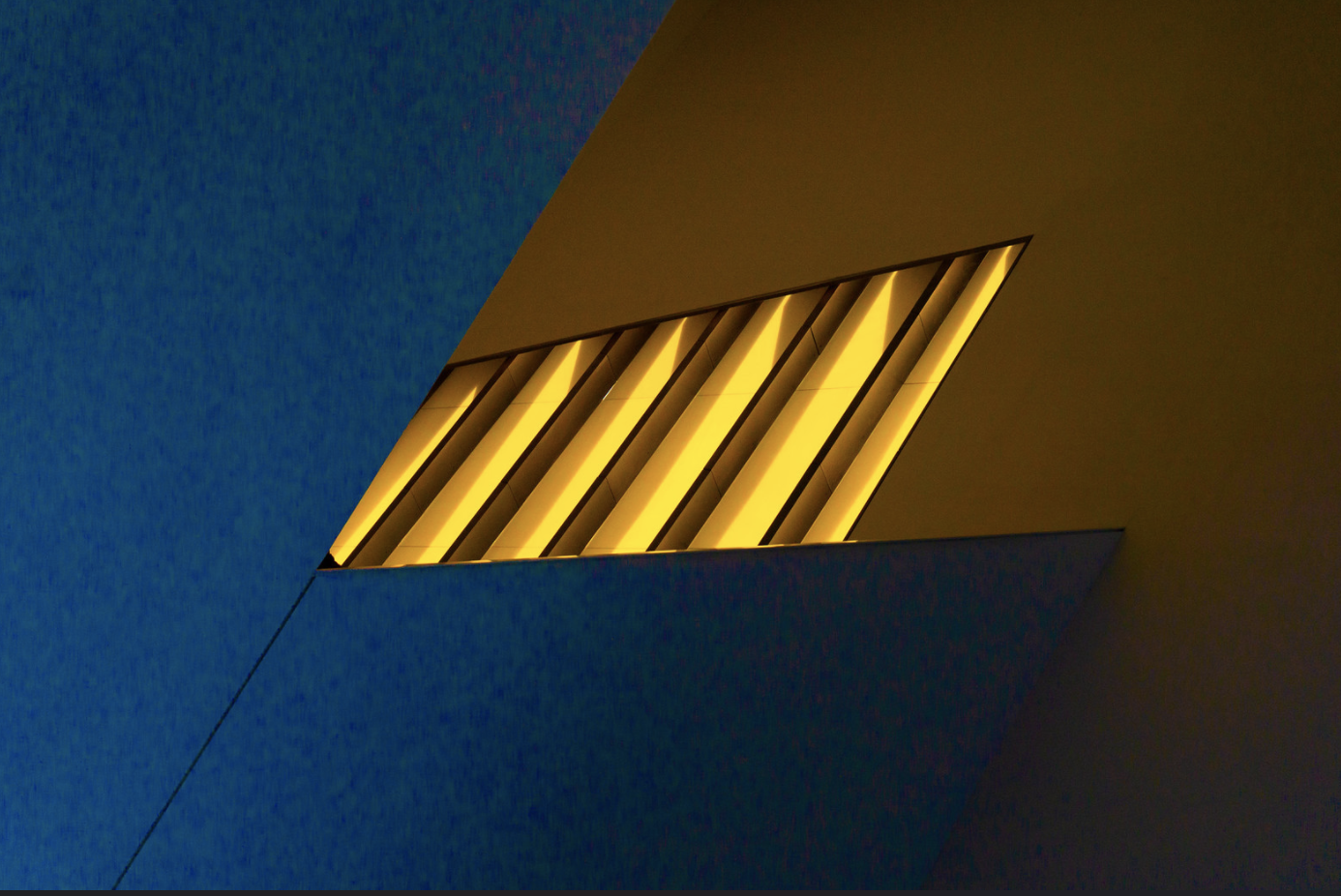
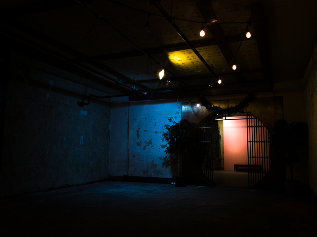
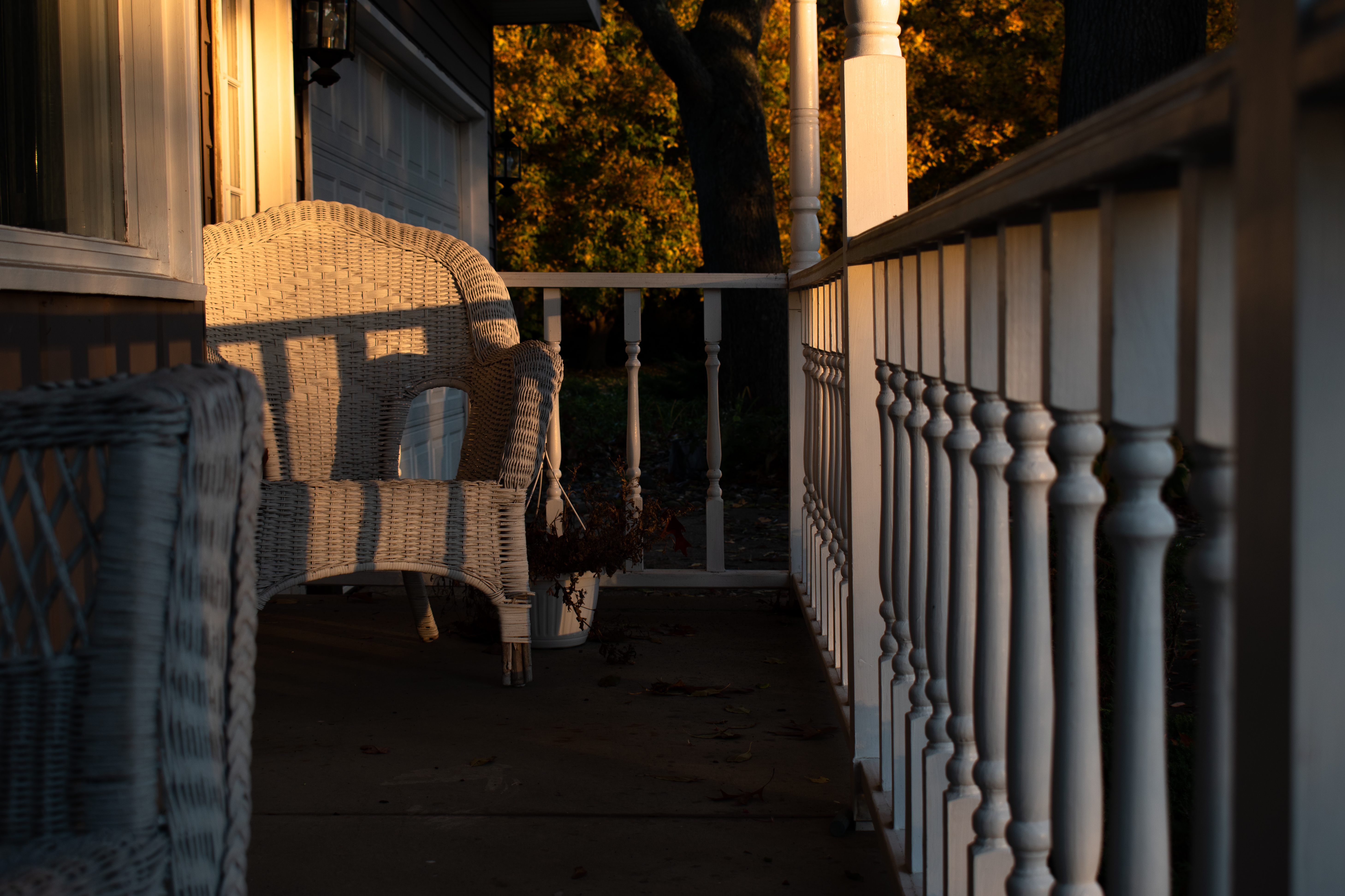
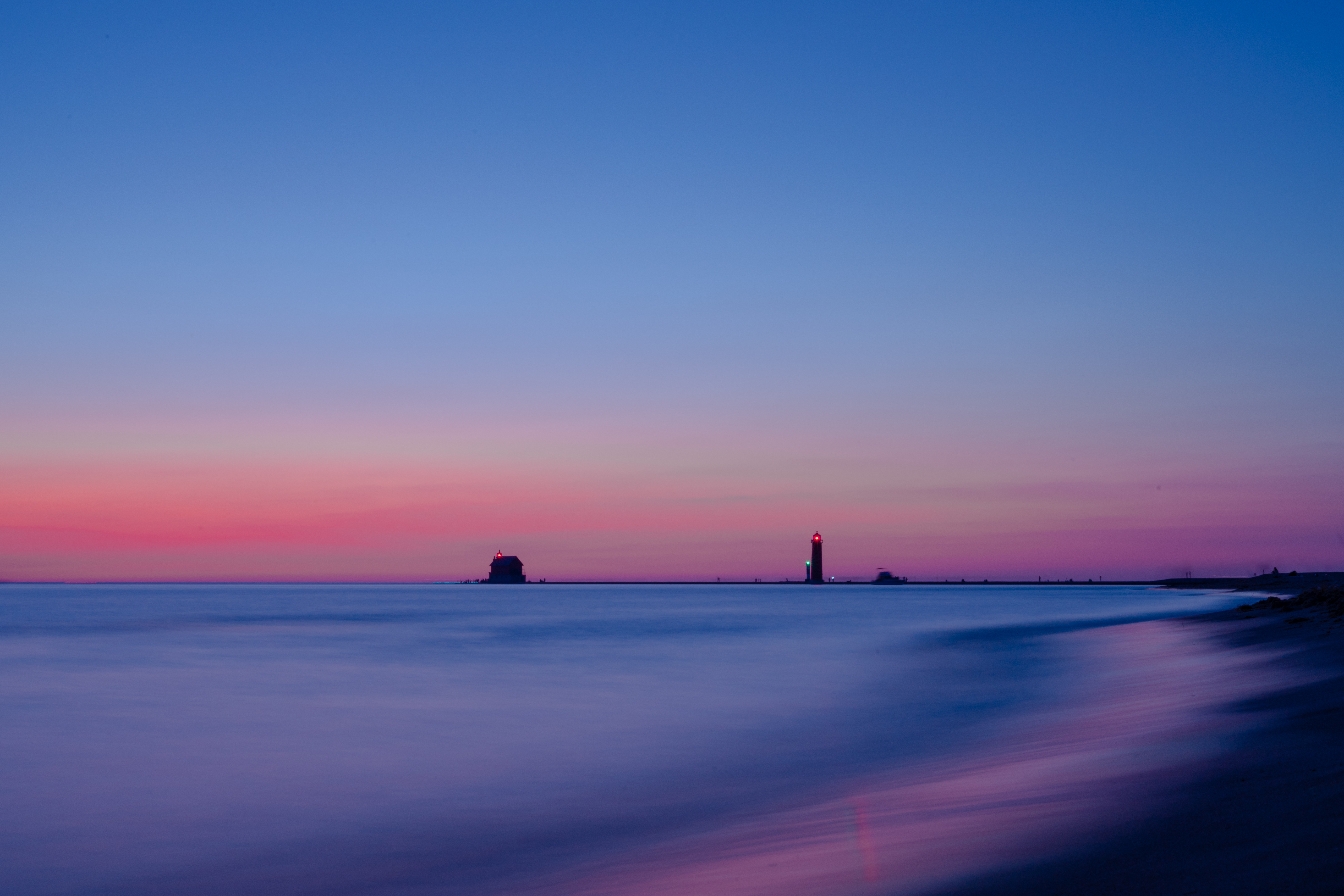
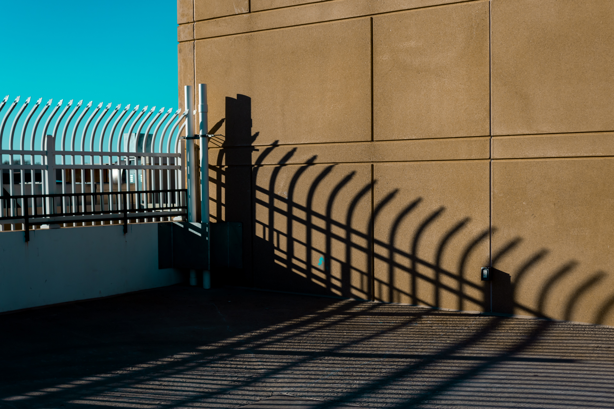
My student’s color work surrounds the idea of color: complementary, contrast and harmony. I encourage them to seek out these spaces in the real world, as well as create scenarios within their own control. To introduce them to color, we begin by seeking out spaces of black and white in real space with no color at all. They are not allowed to change the image to black and white in post production, because the point is to seek real contrast in real space. By doing this, they are seeking the black and white value system already, promising there will be contrast existing in their photograph within having to ‘make it’ in post production.
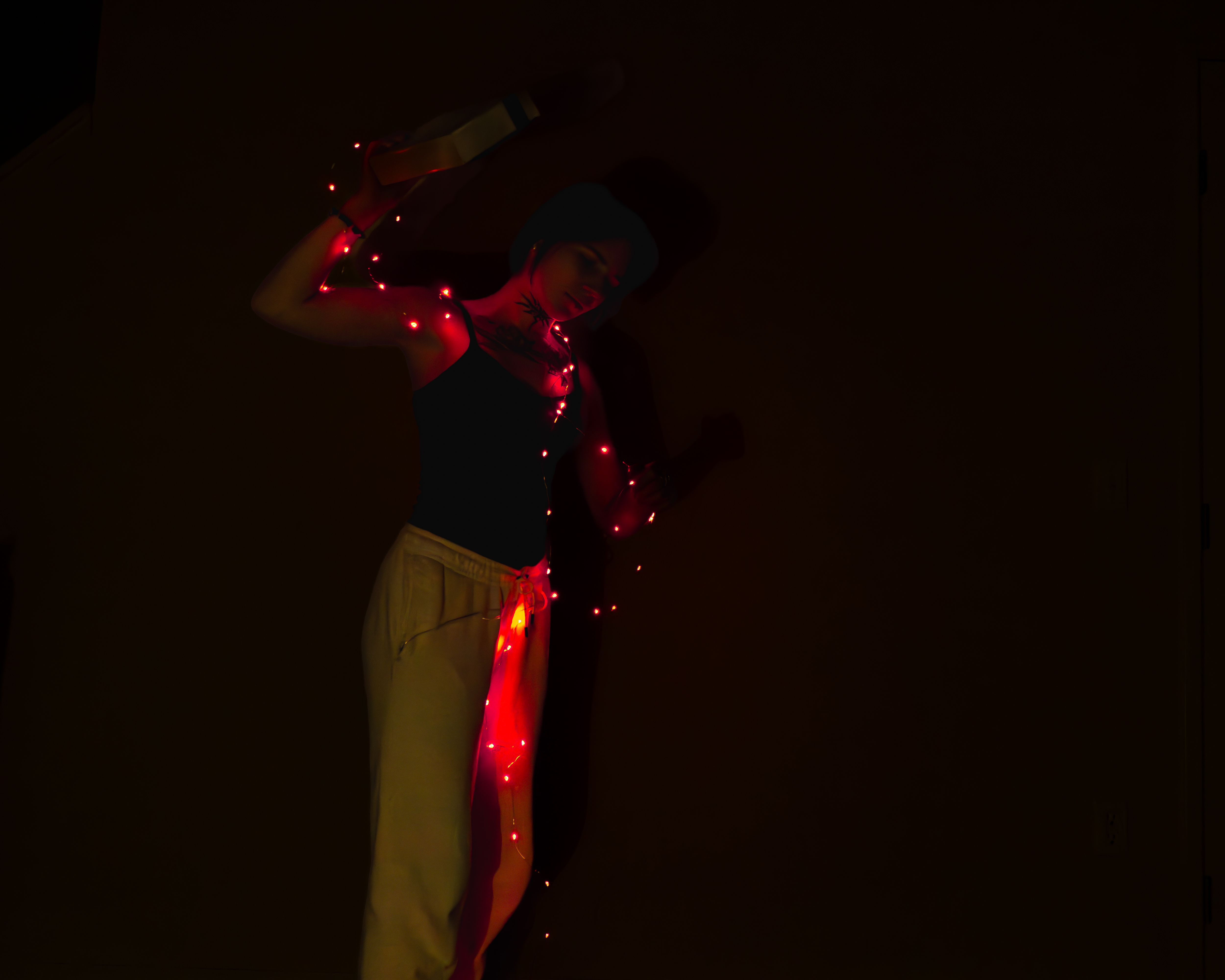
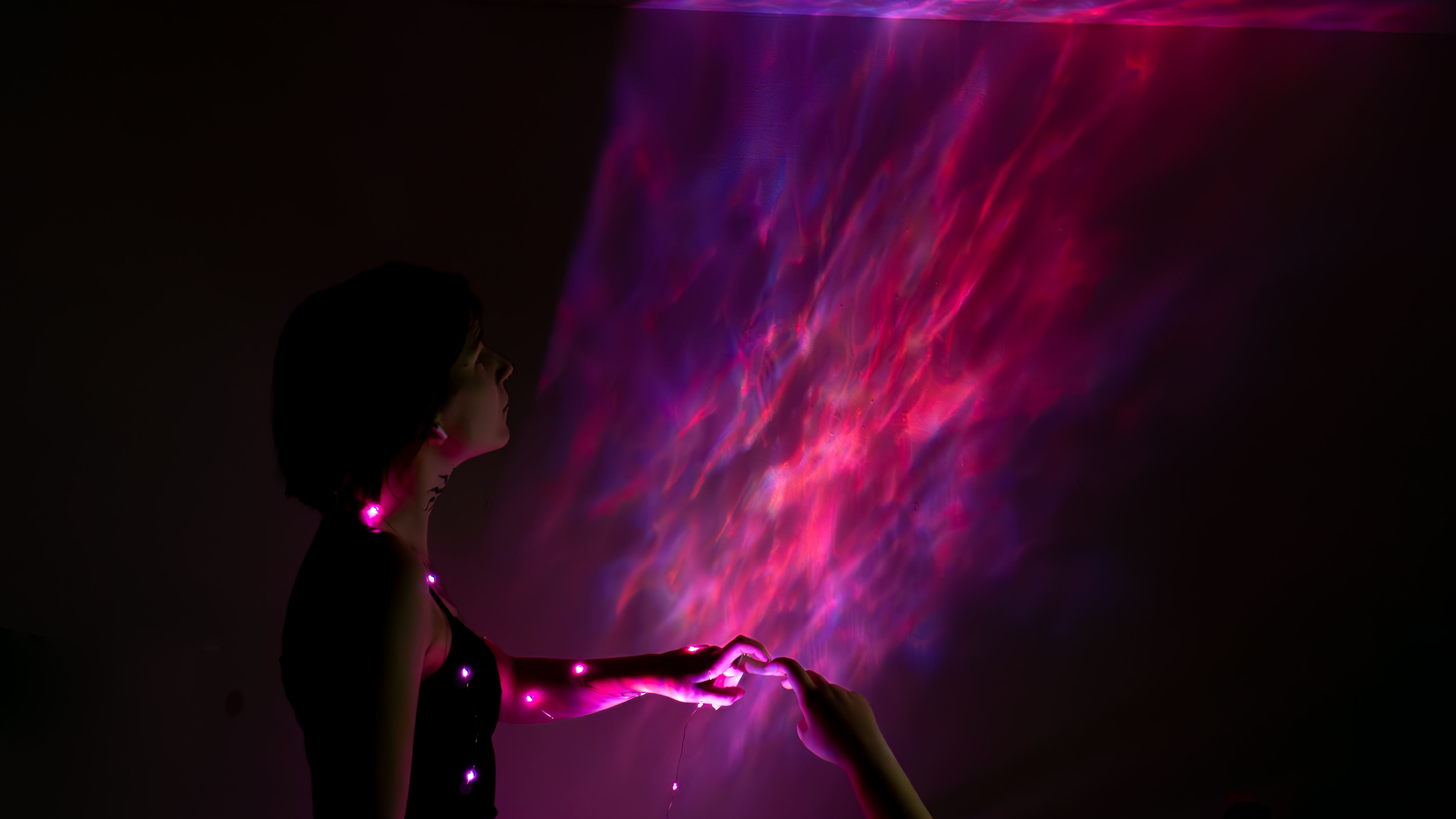
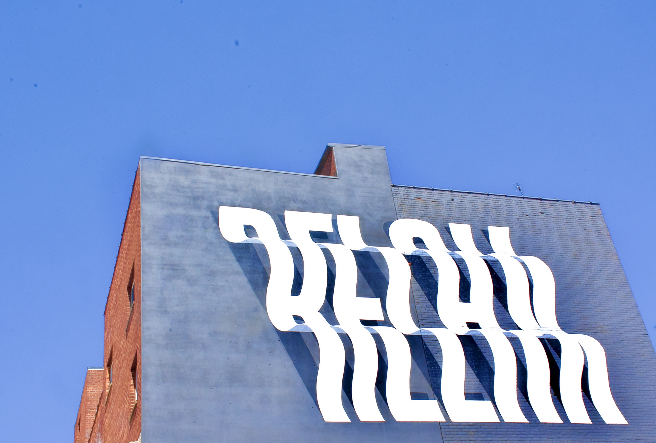
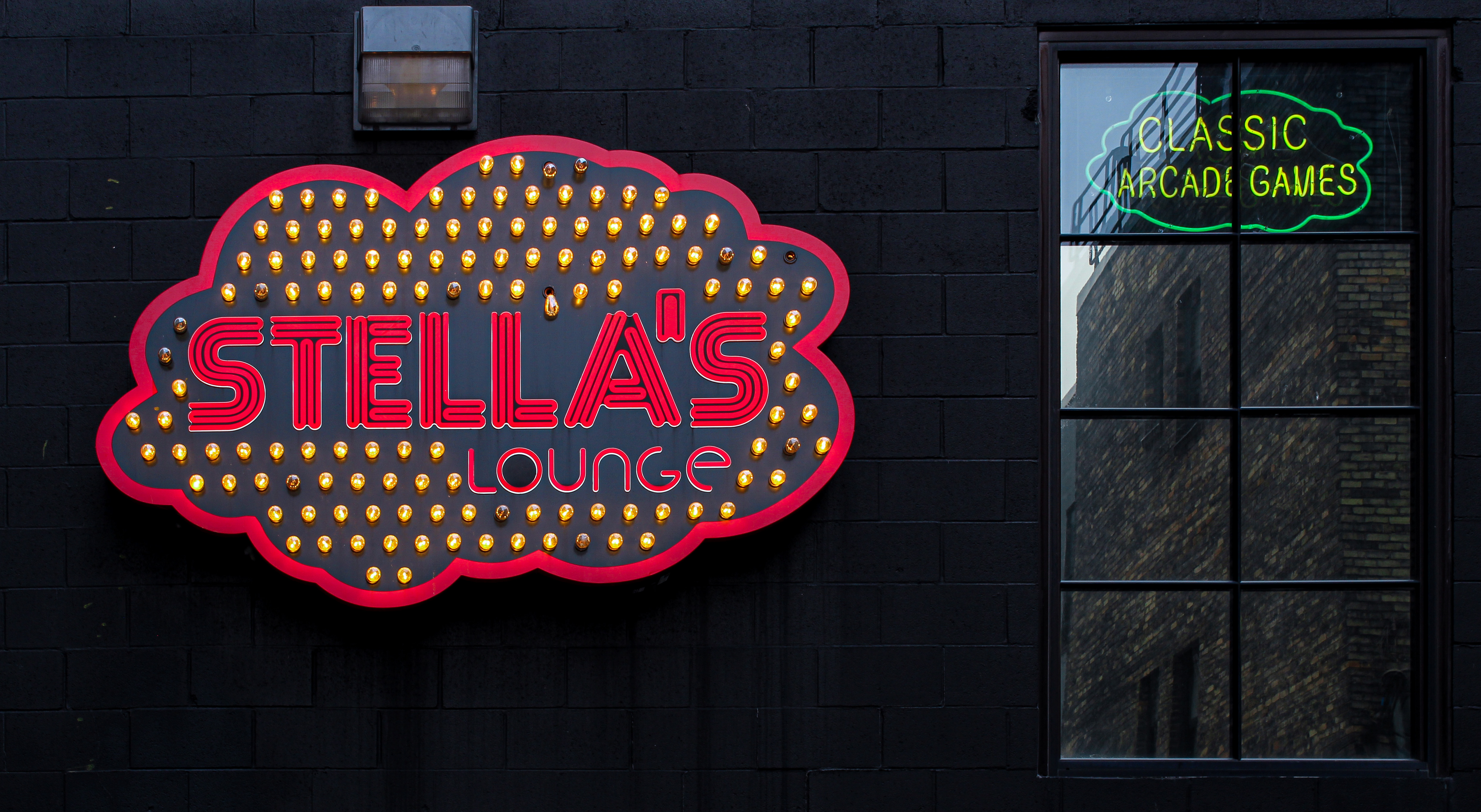
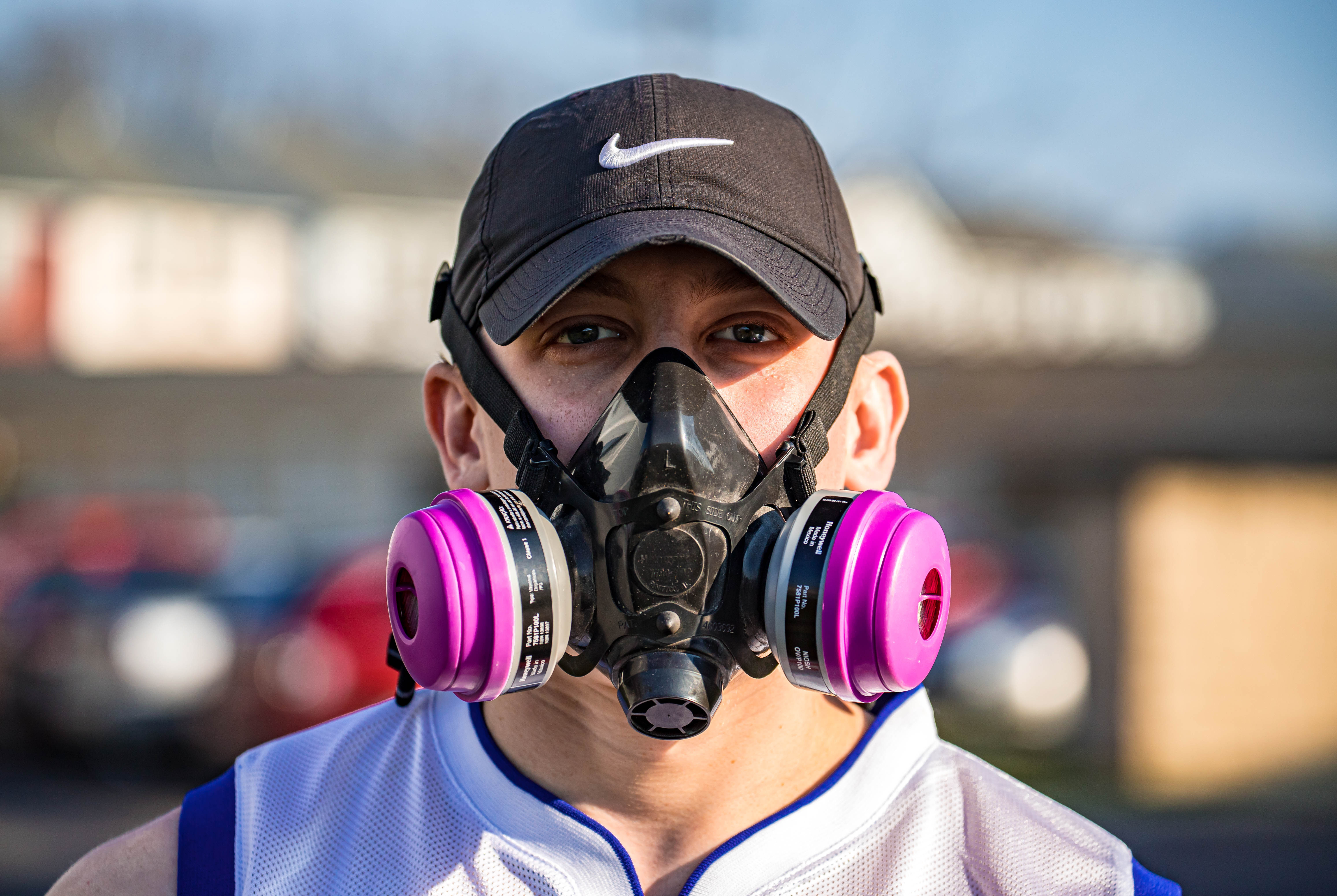
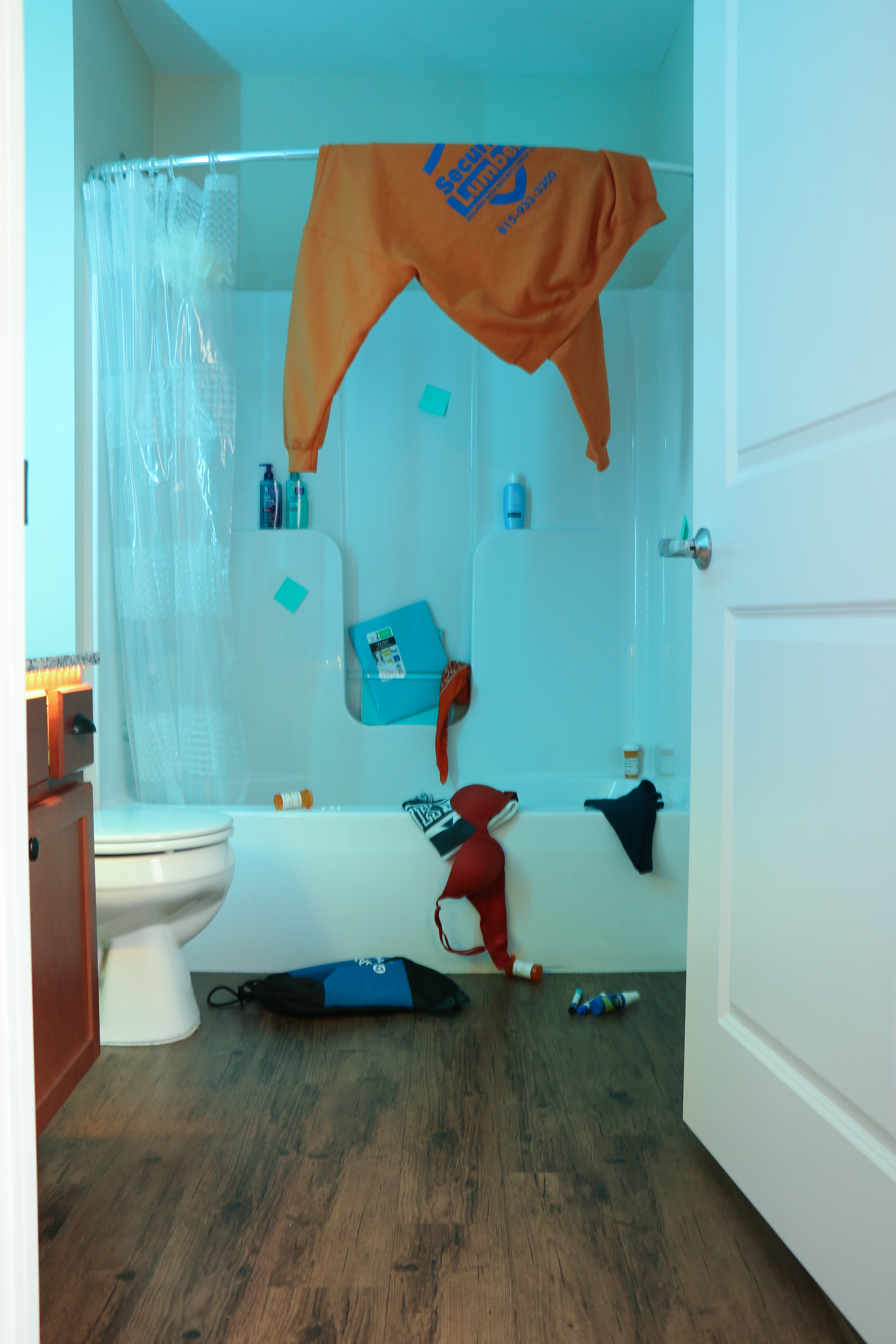
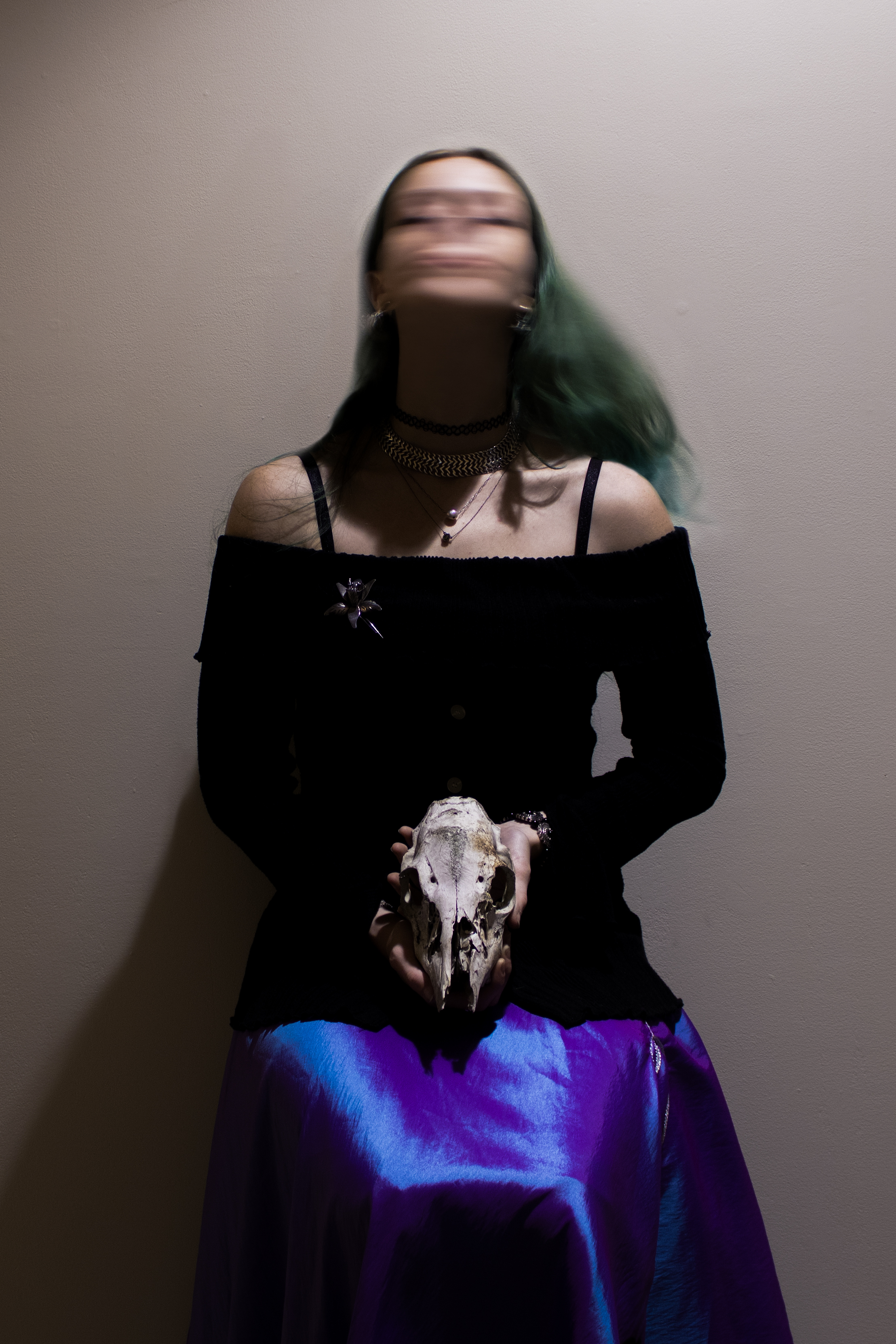
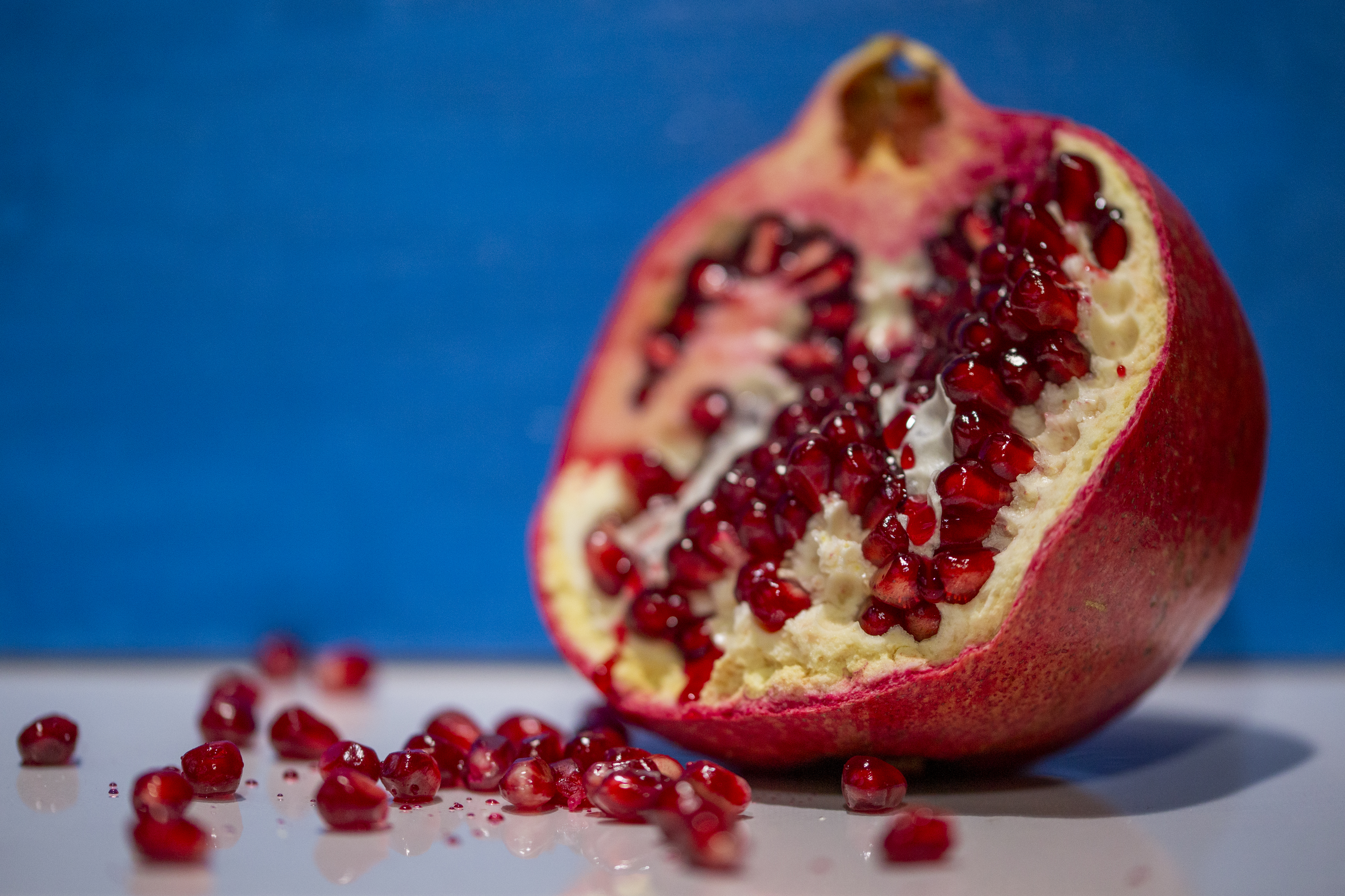
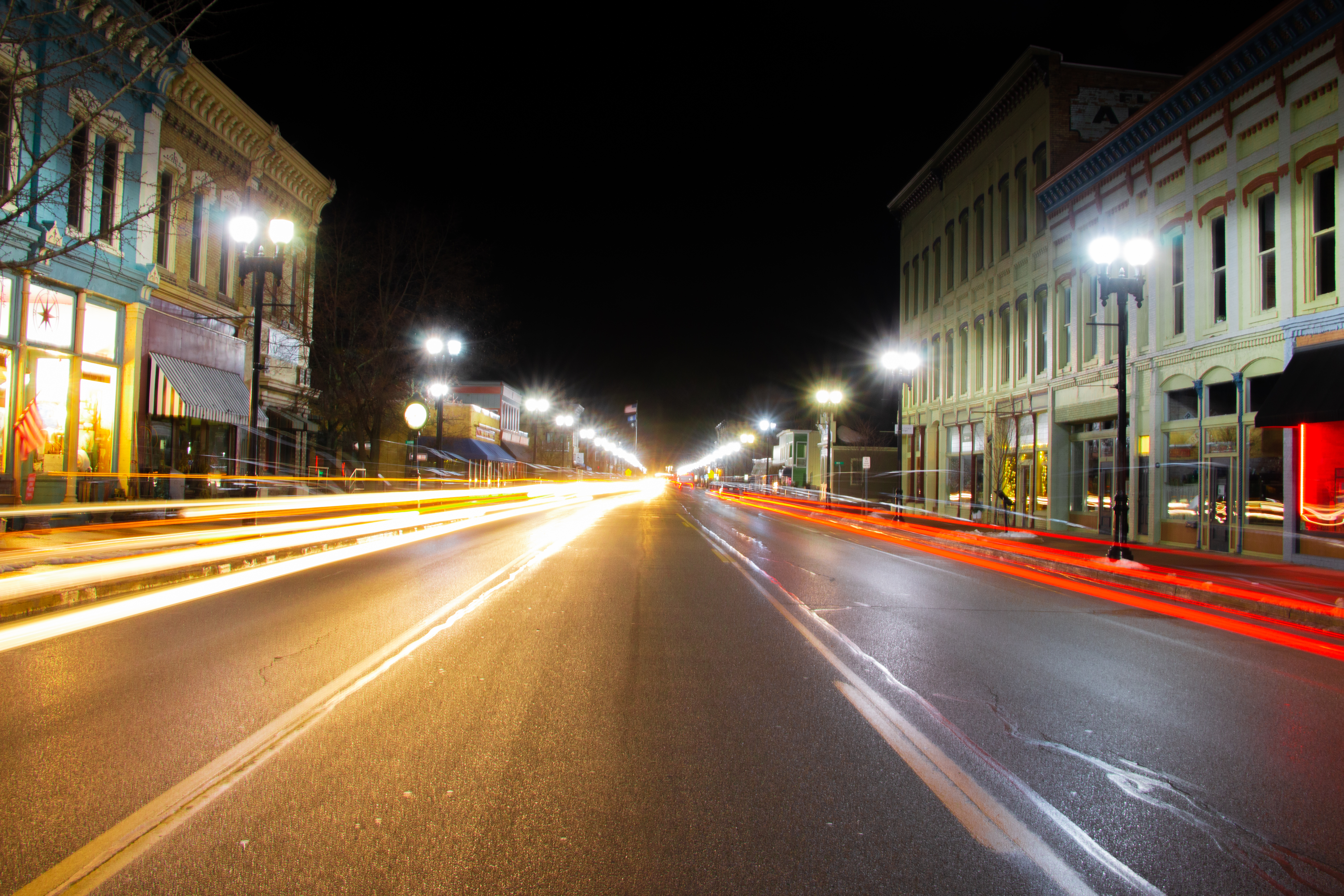
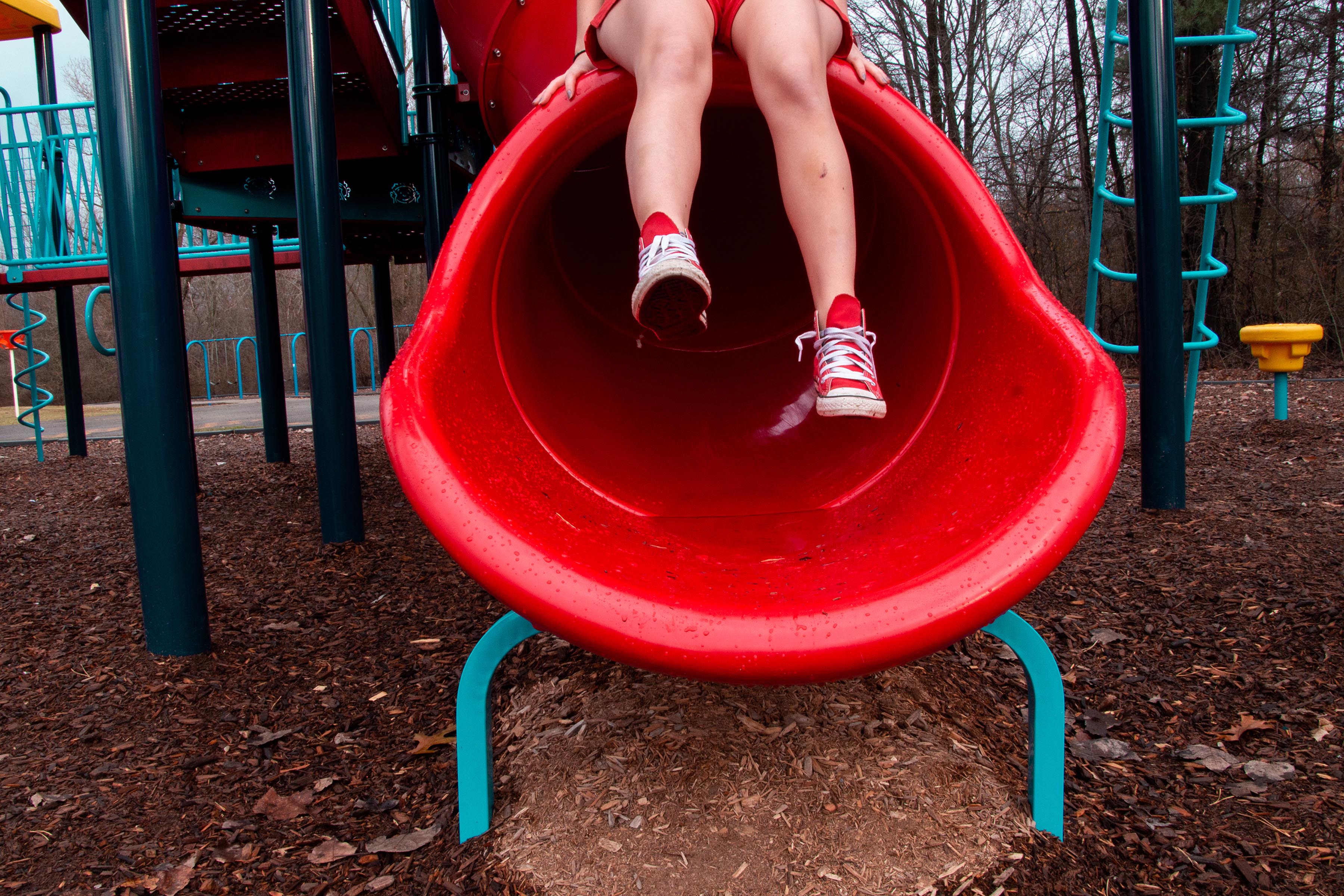
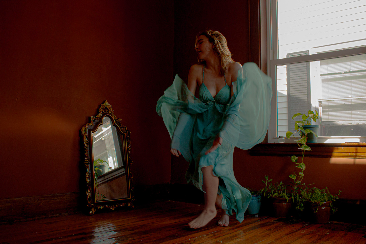
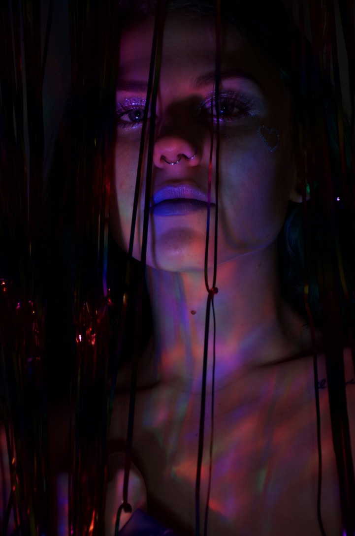
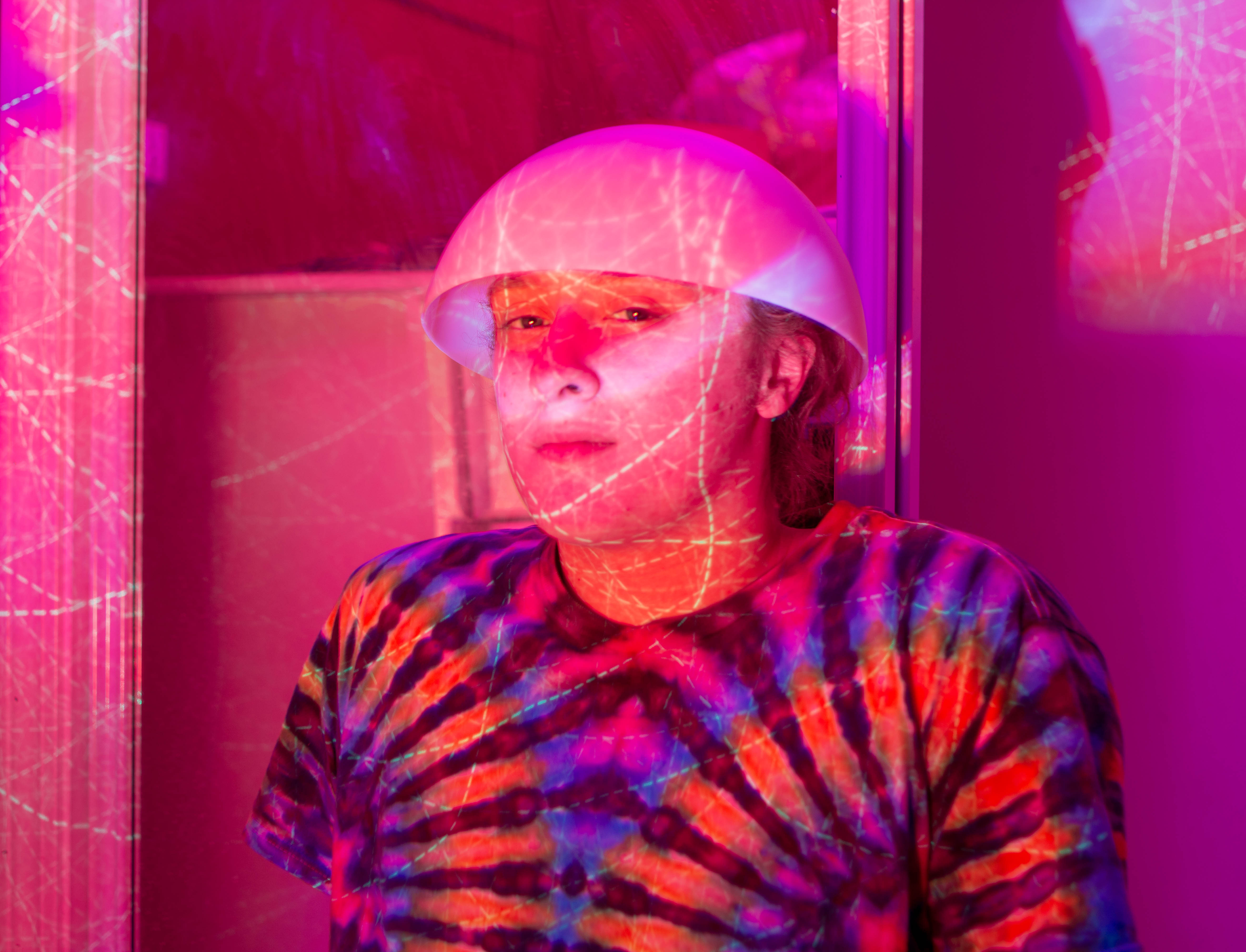
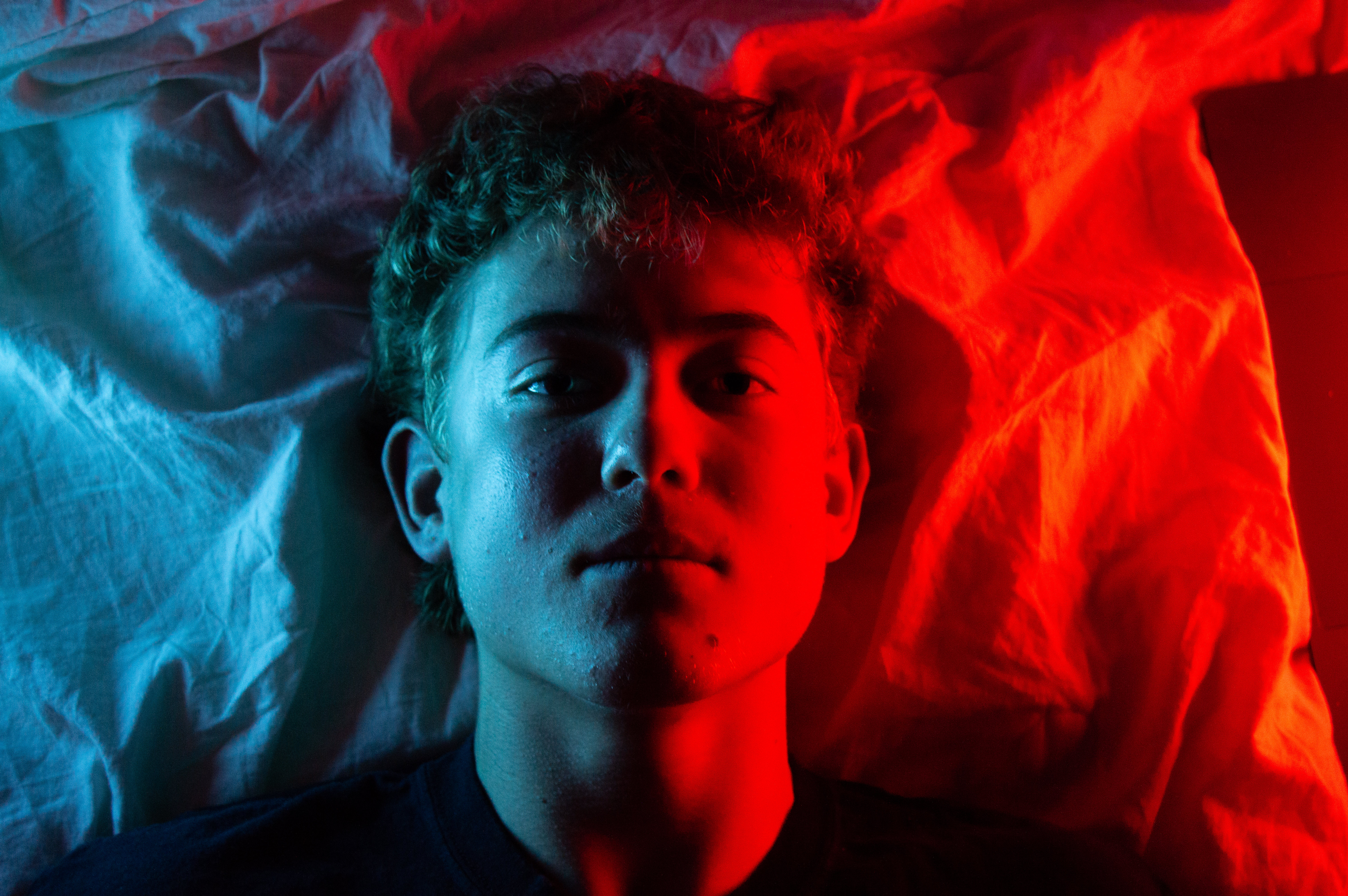
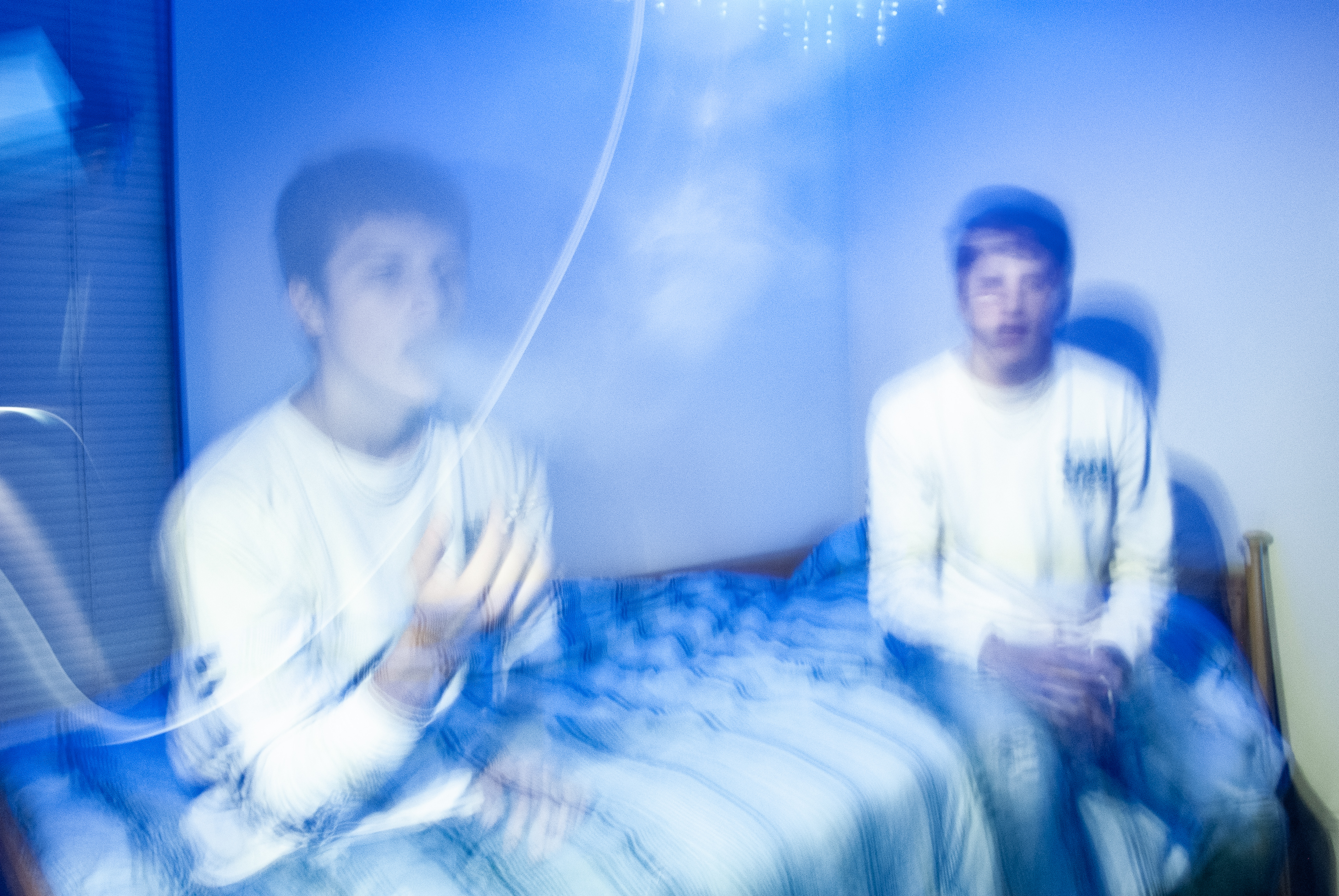
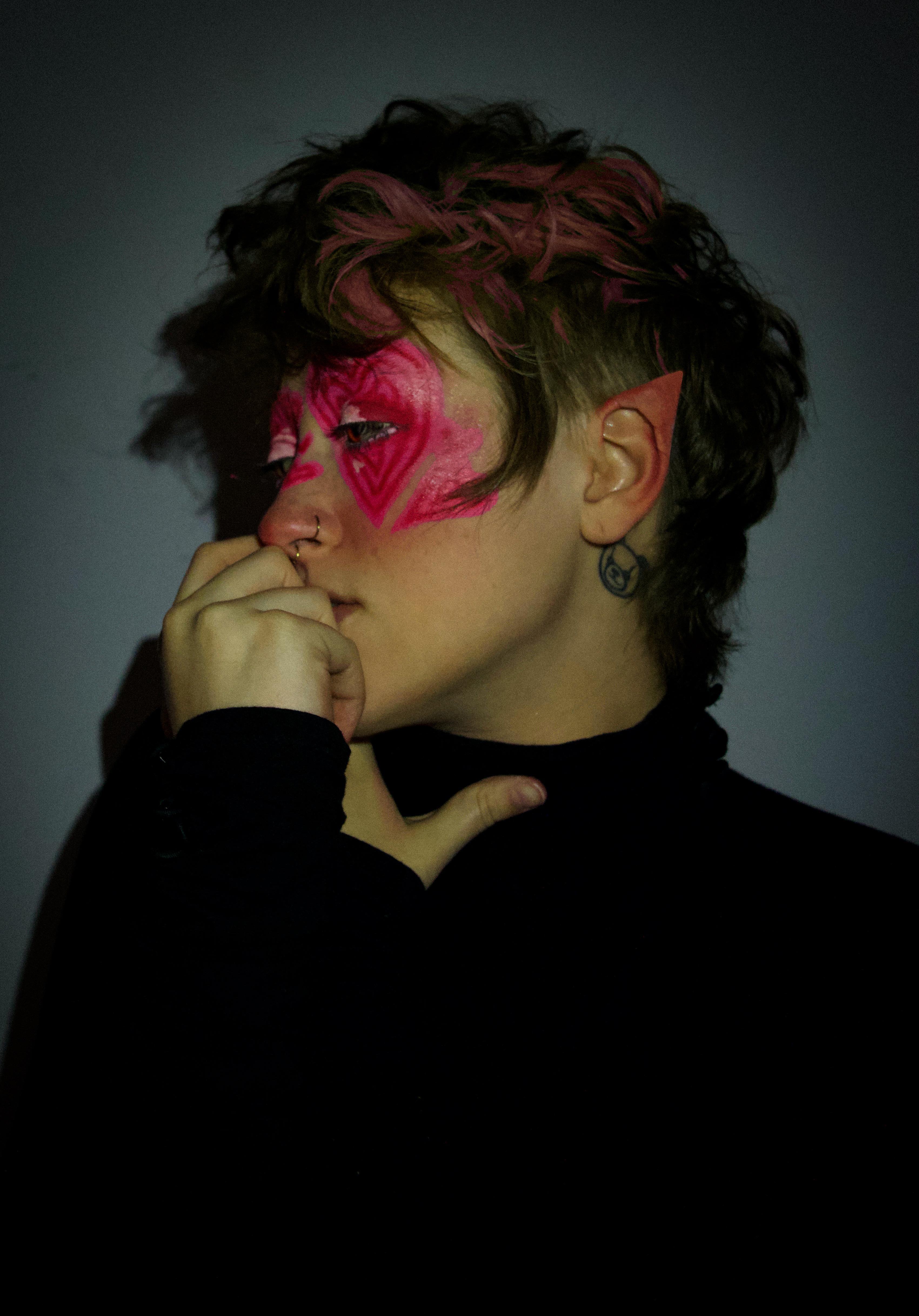
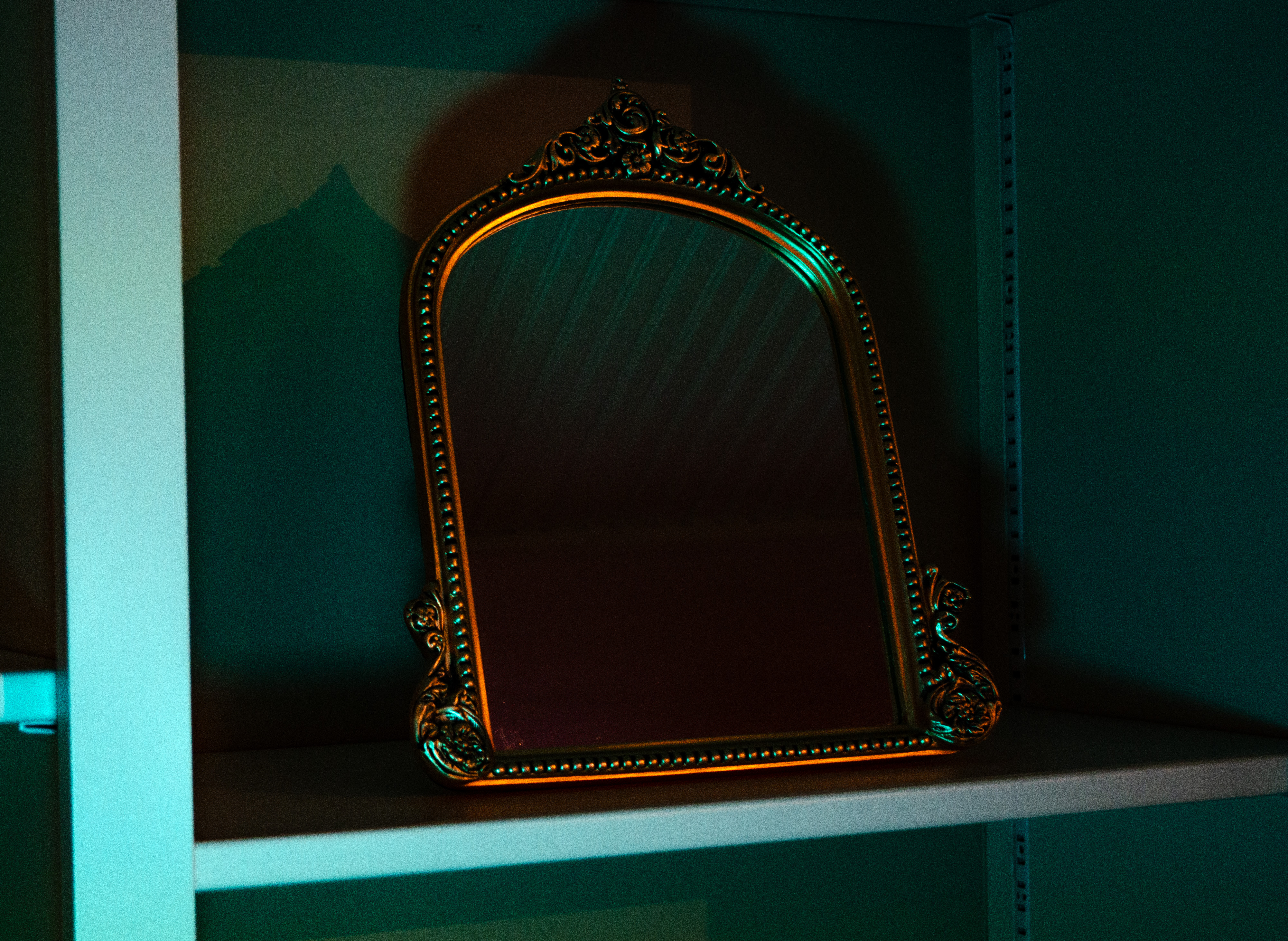
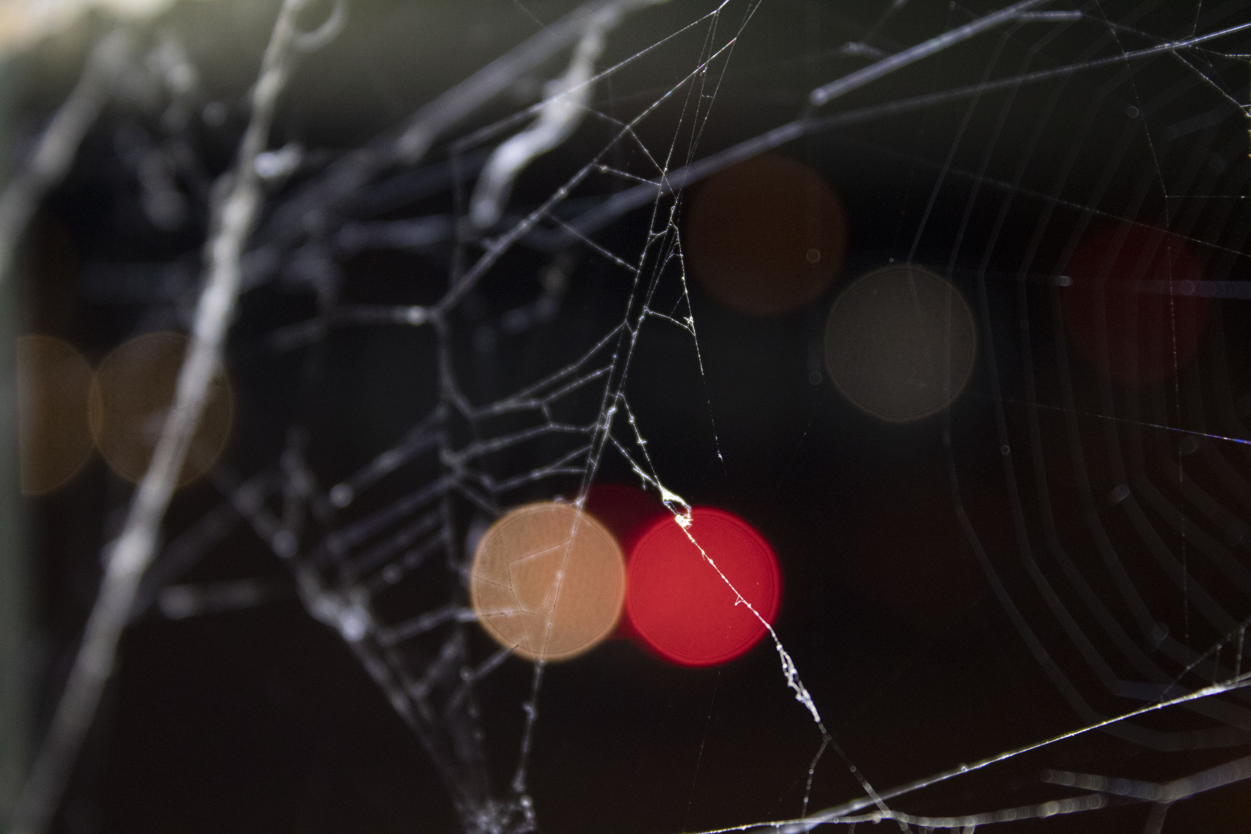
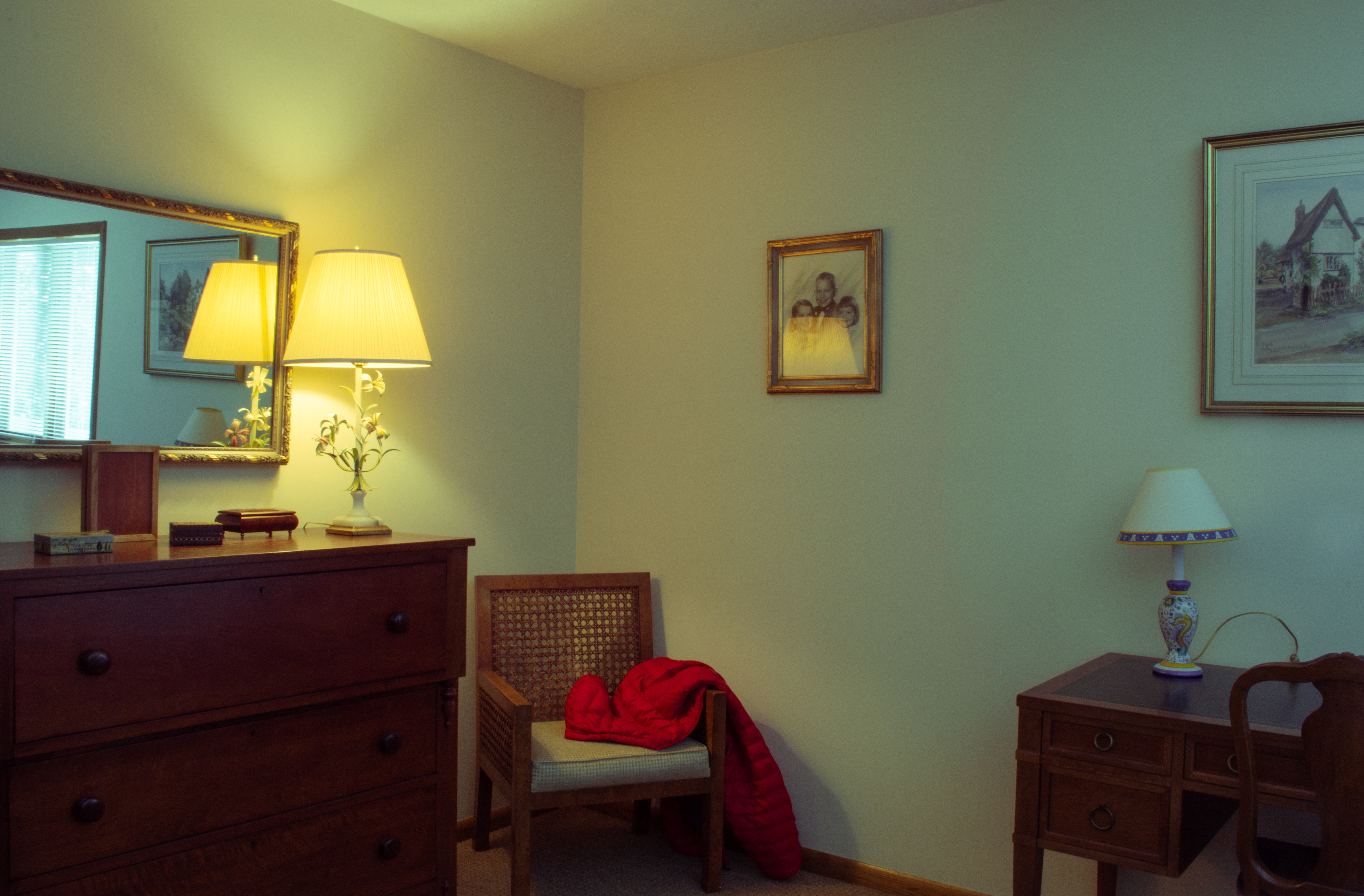
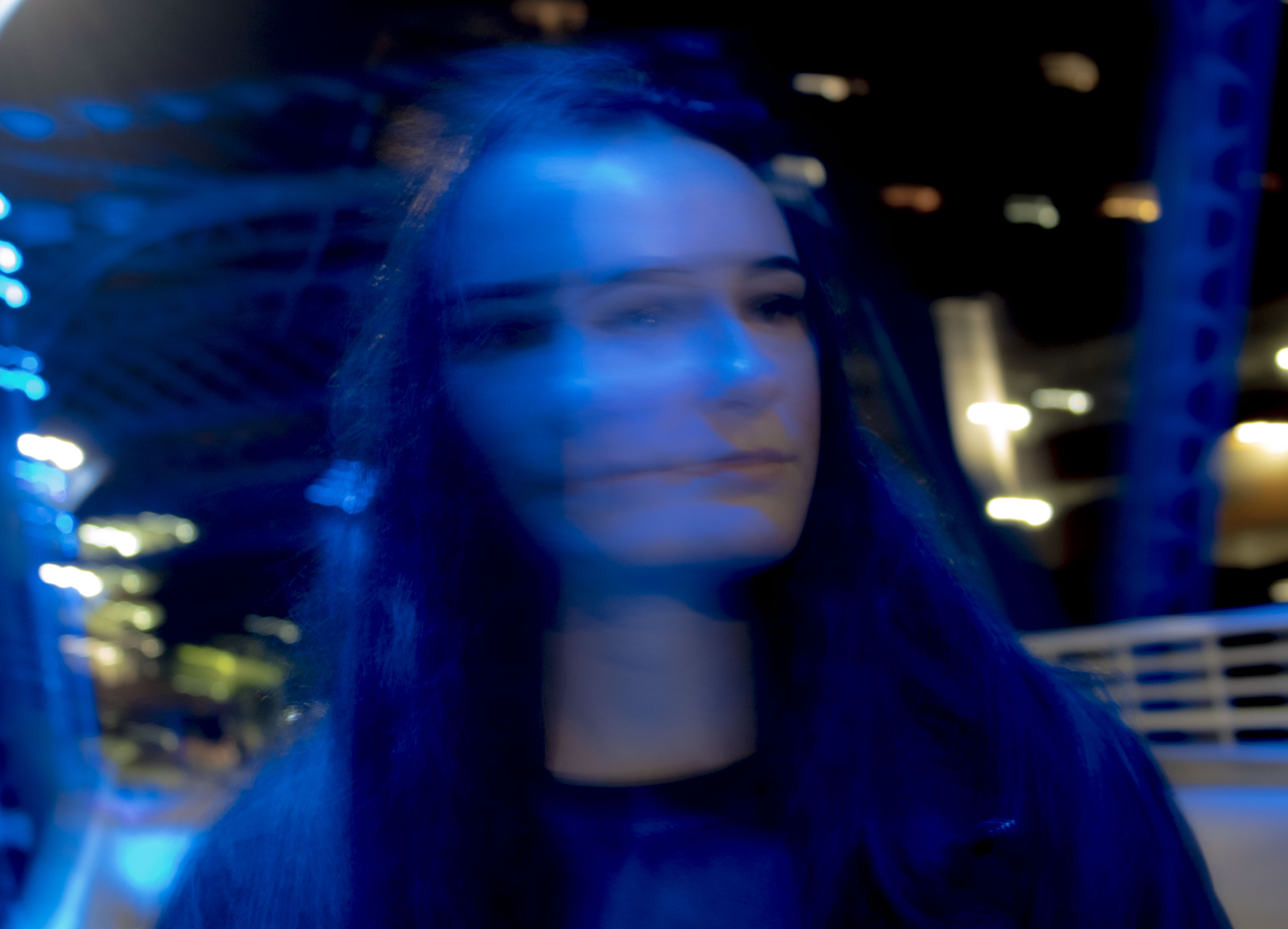
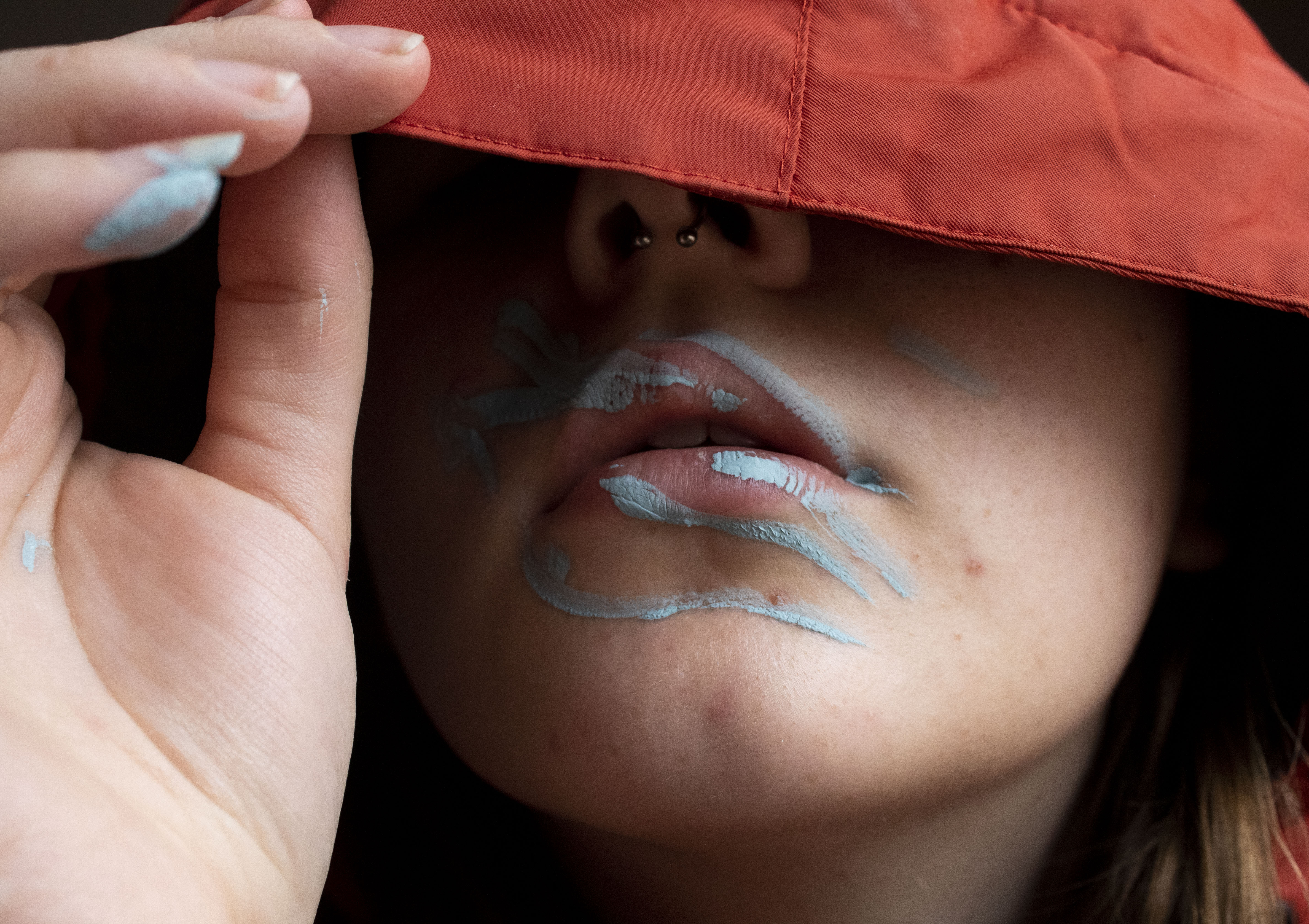
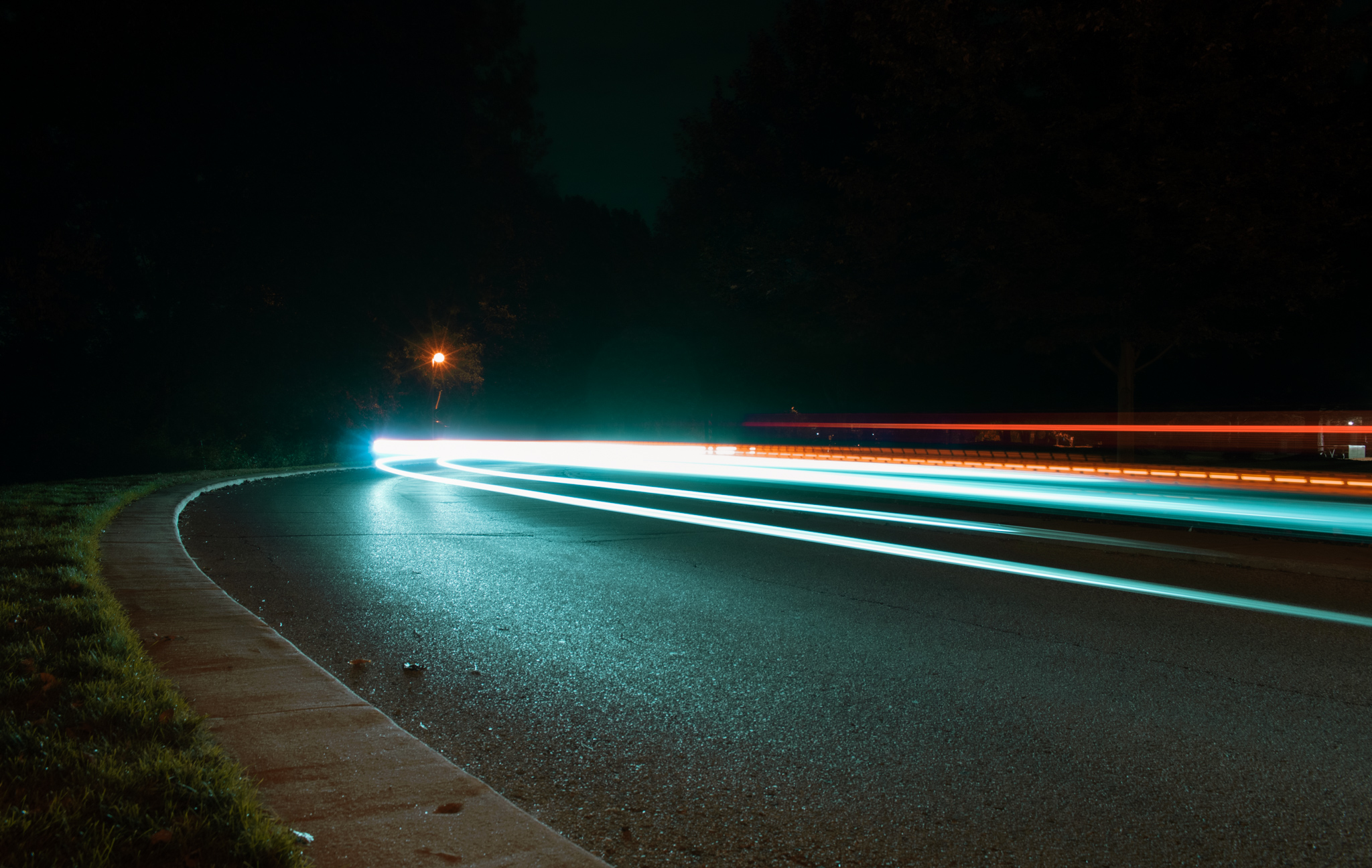
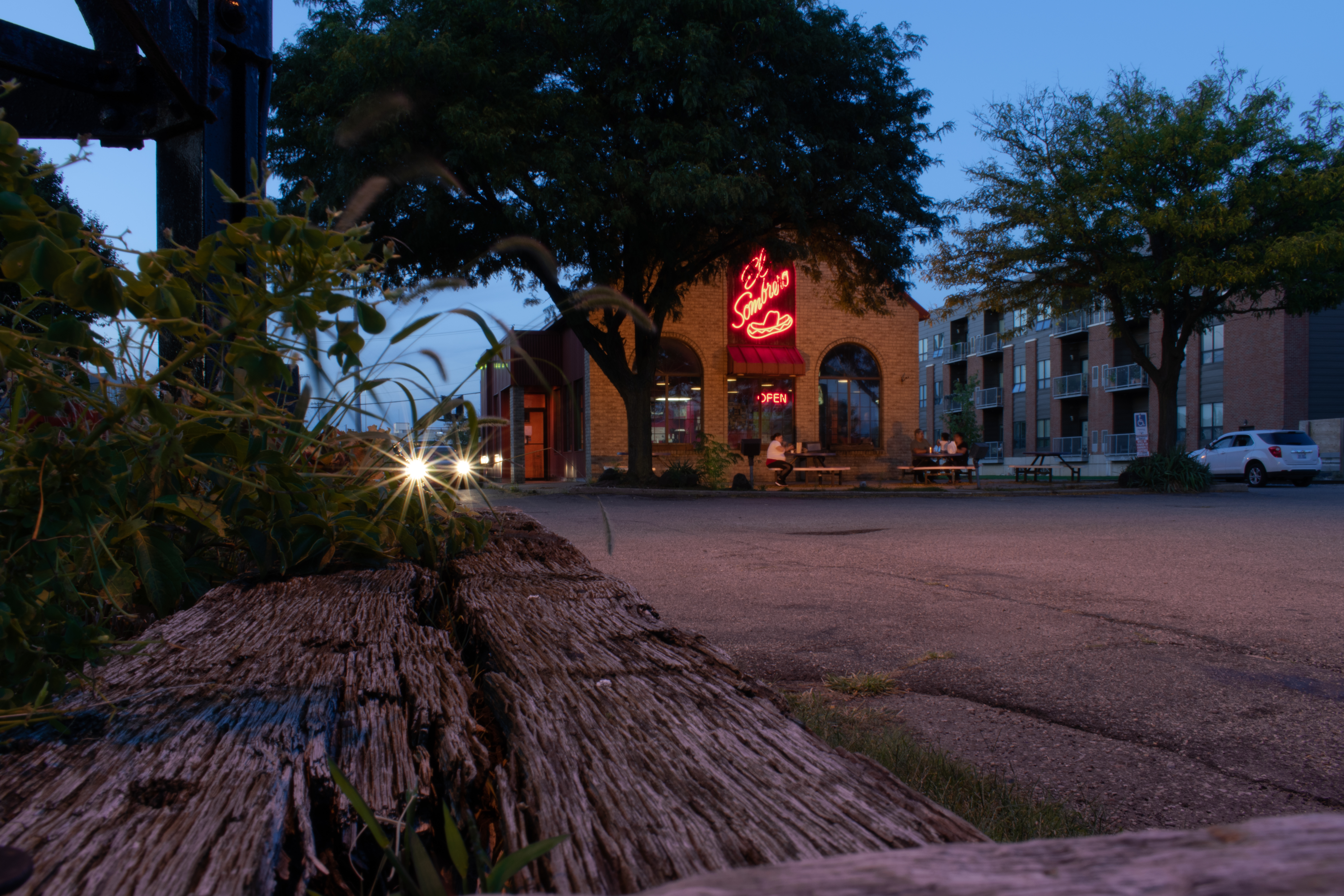
After this step, they will add a ‘pop of color’ to a black and white or mundane space. By doing this, students can see how the color draws in the viewer in a different way. Instead of a minimalist image that is usually engaging viewers with design or repetition, the image pulls the viewer with color, and the repetition or space
surrounding the color will be the element of exploratory after the color is scene.
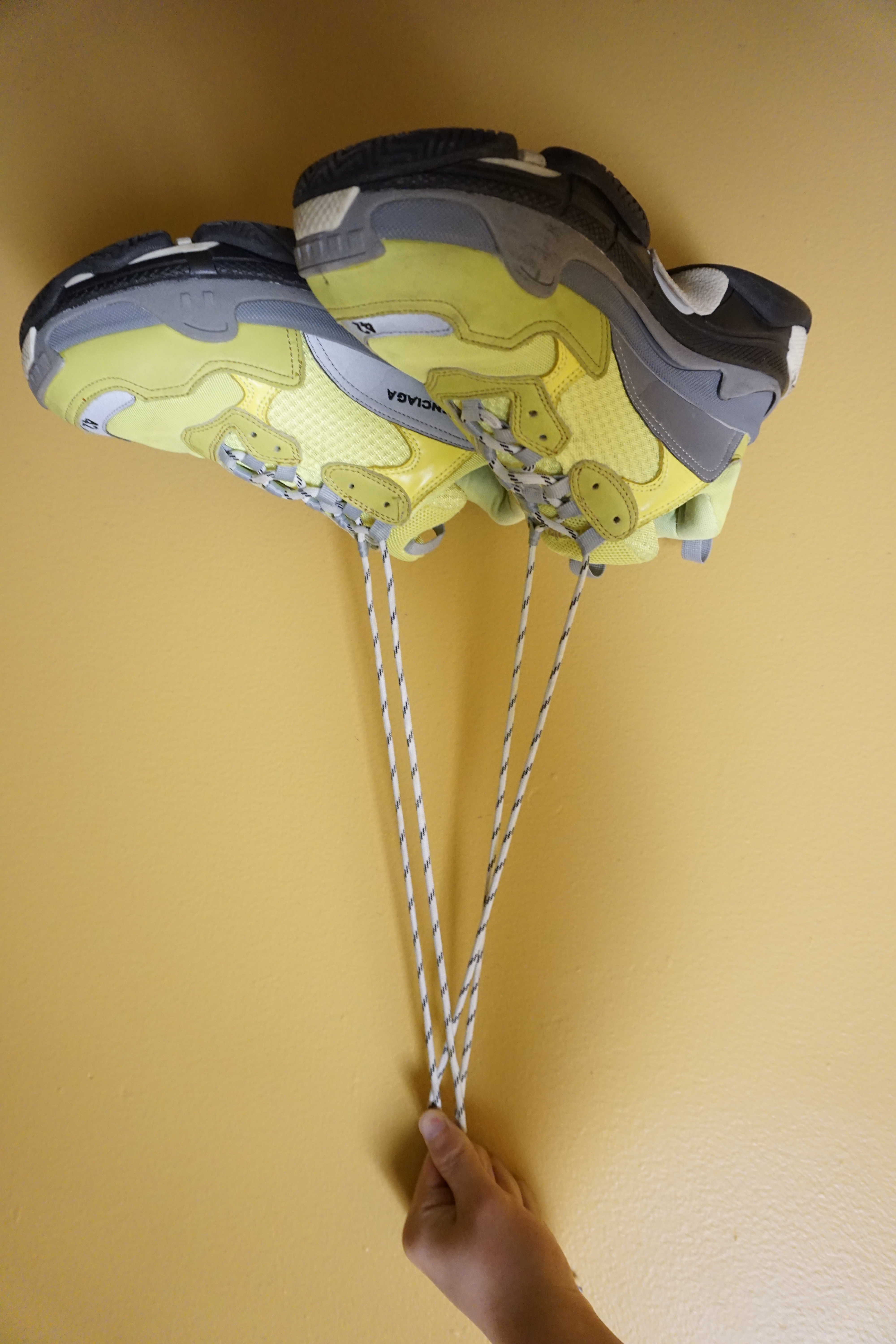
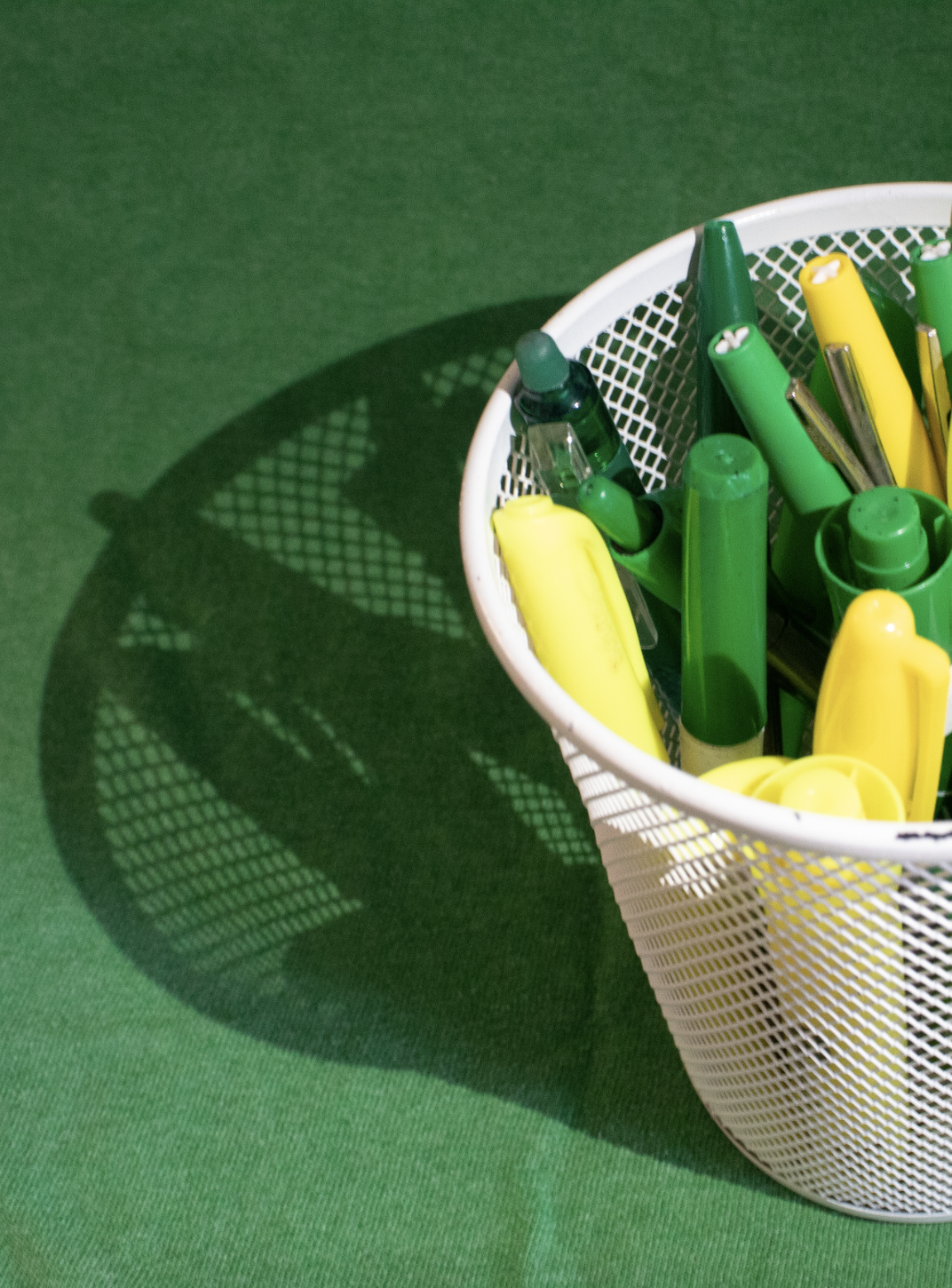
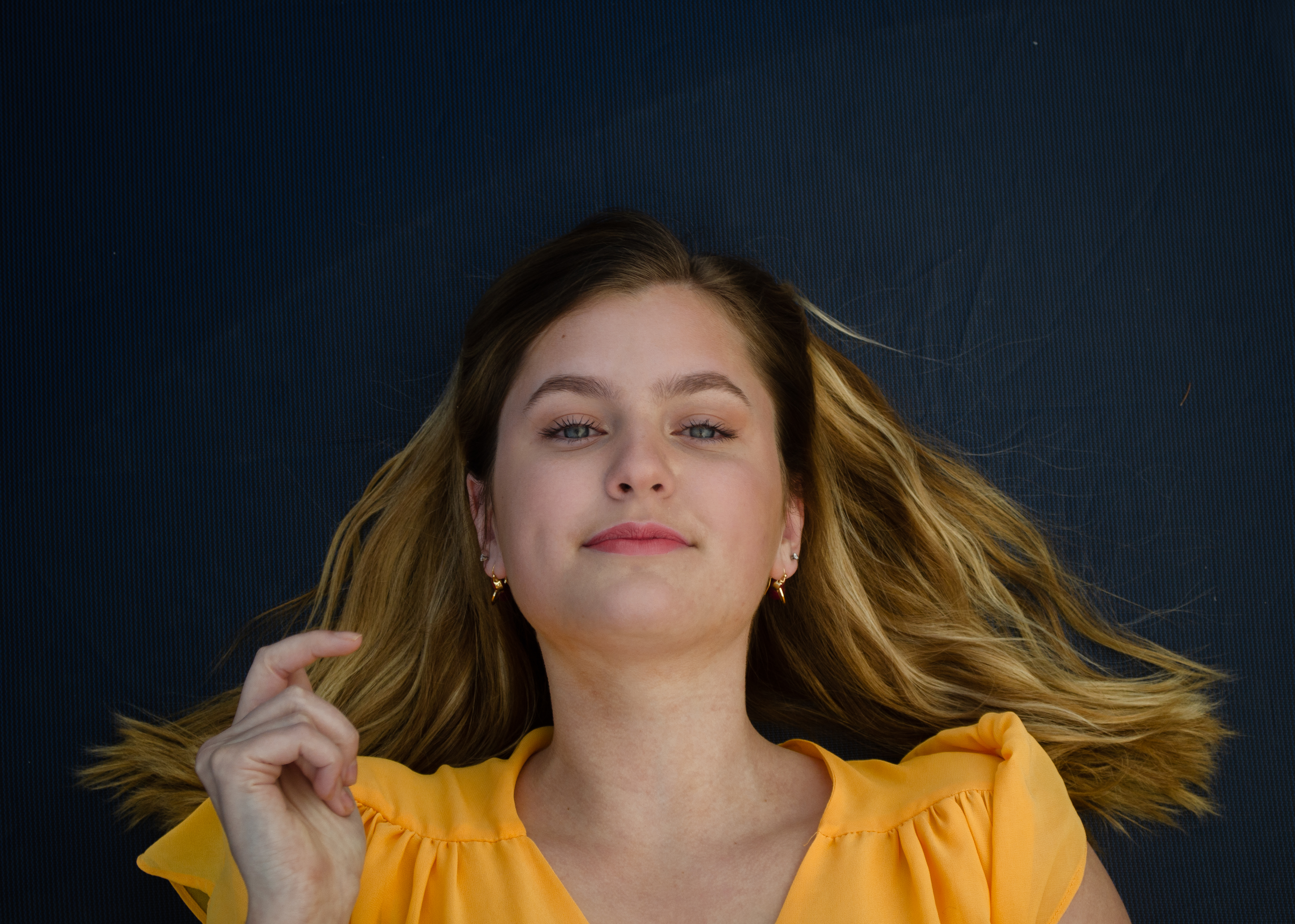
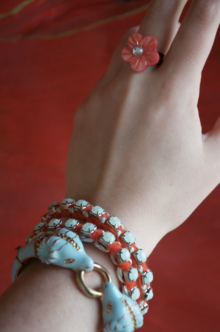
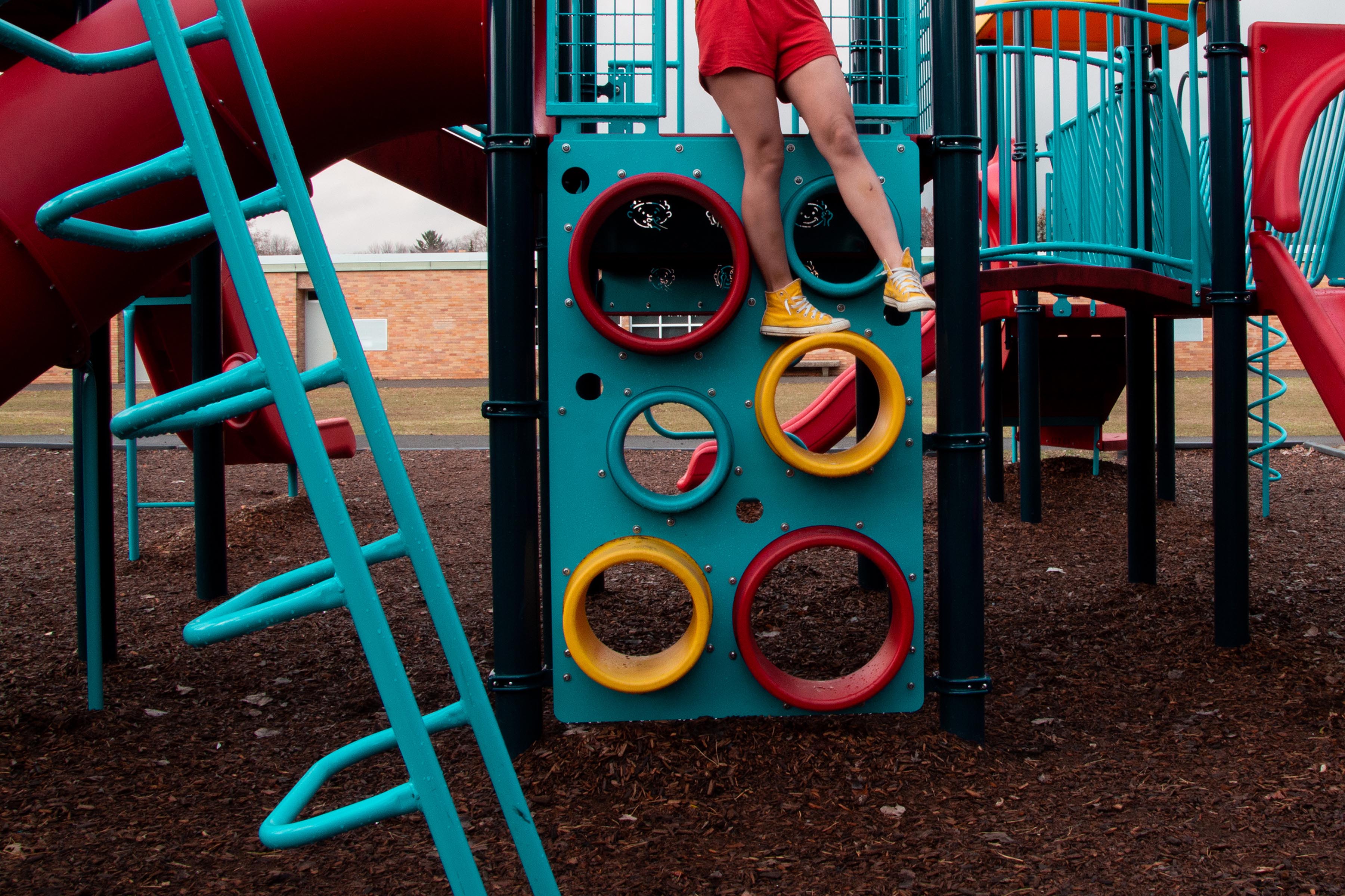
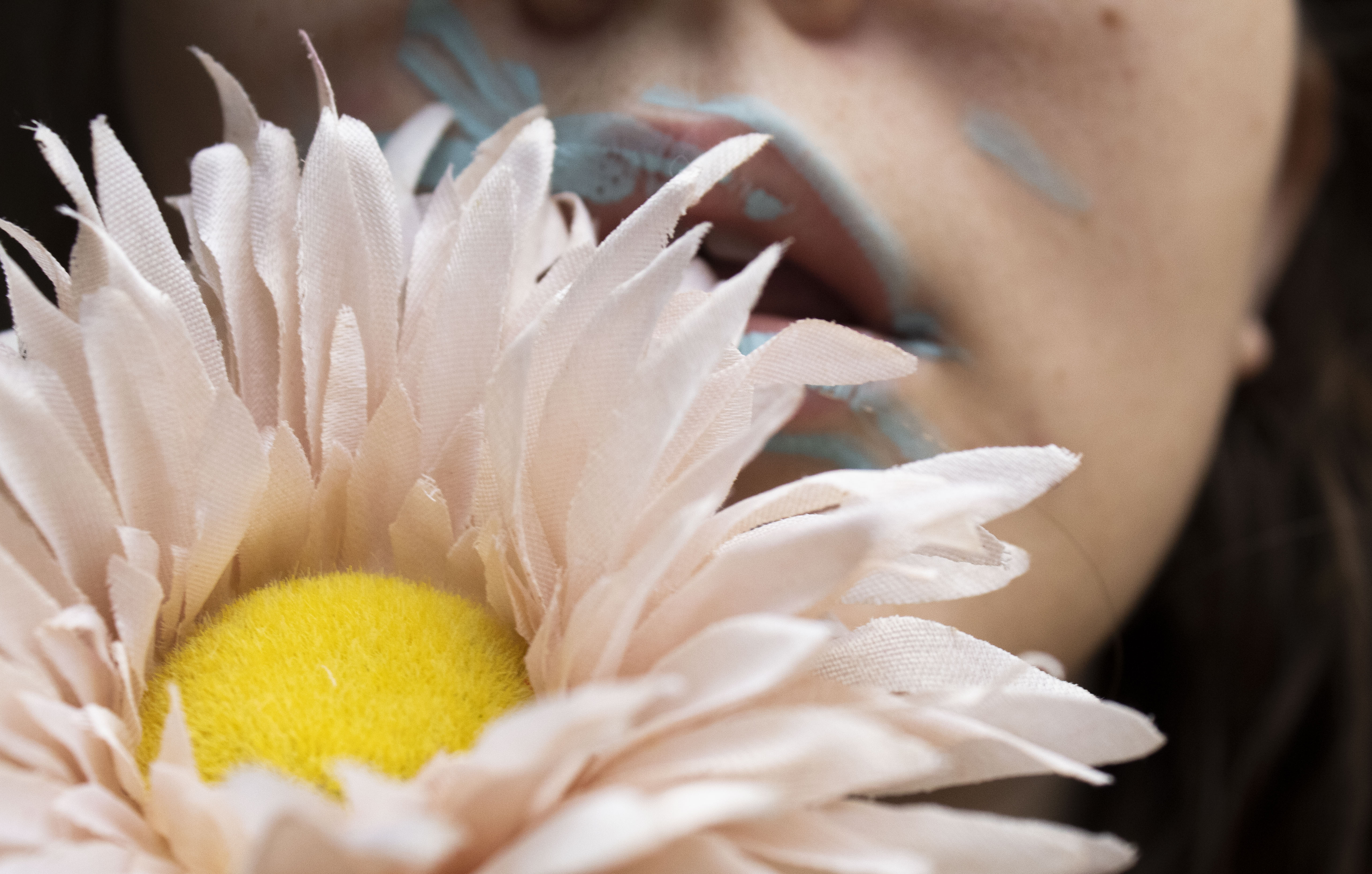
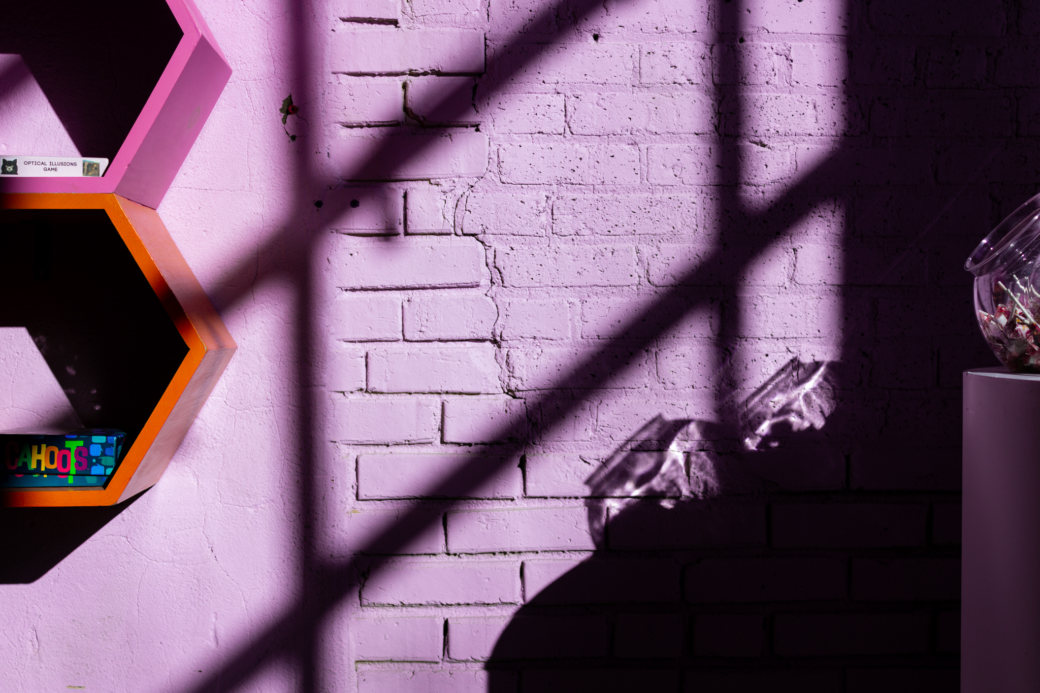
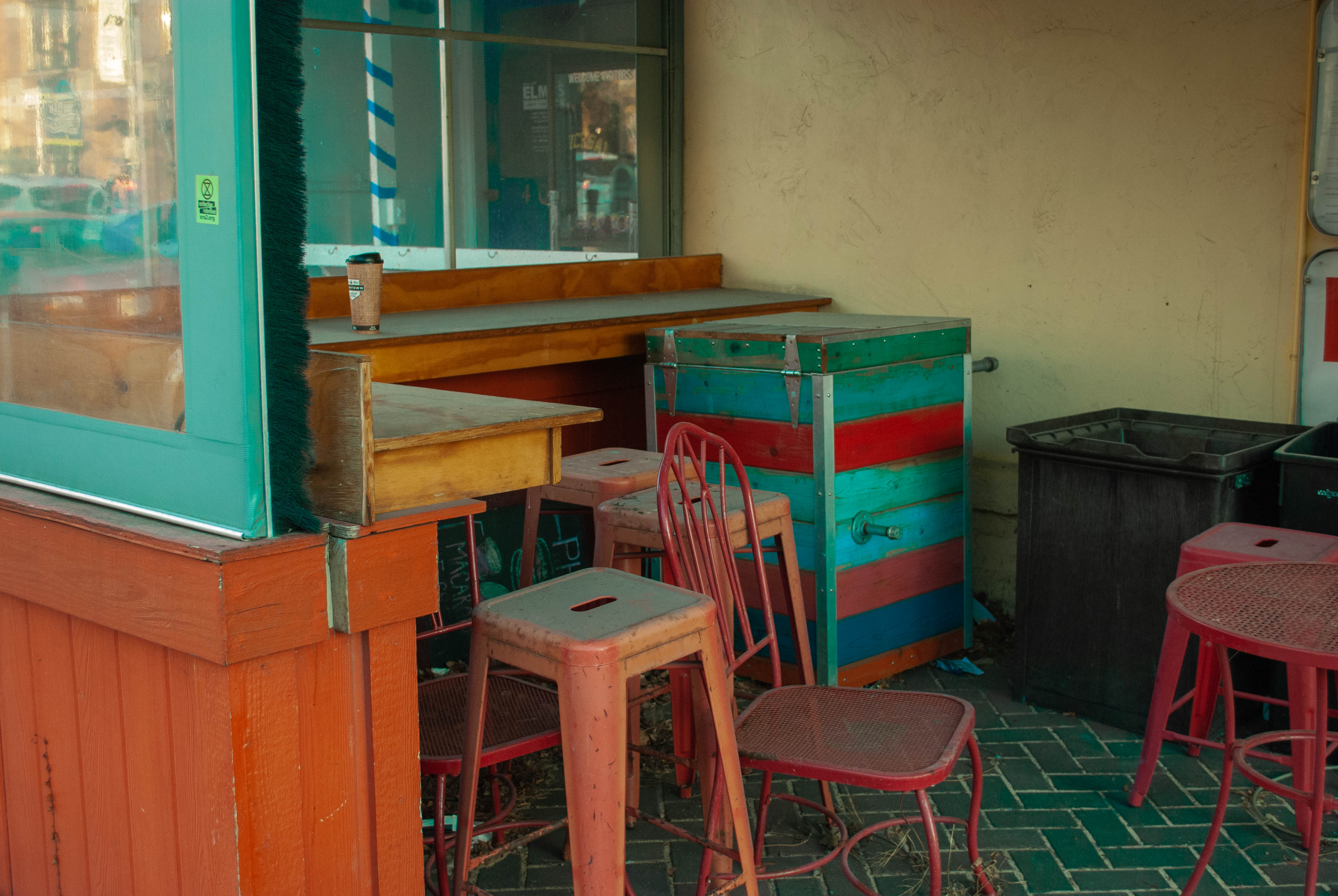
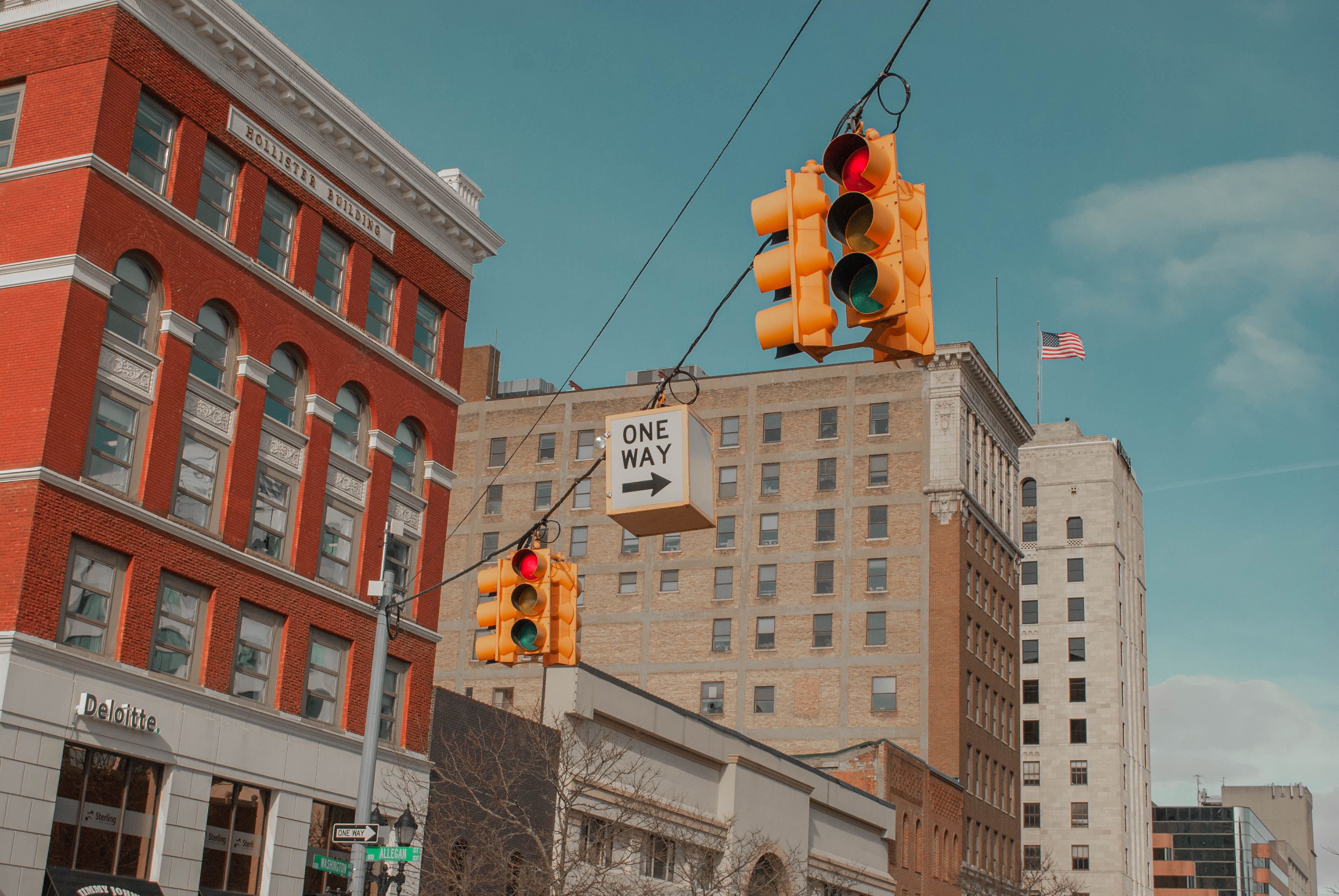
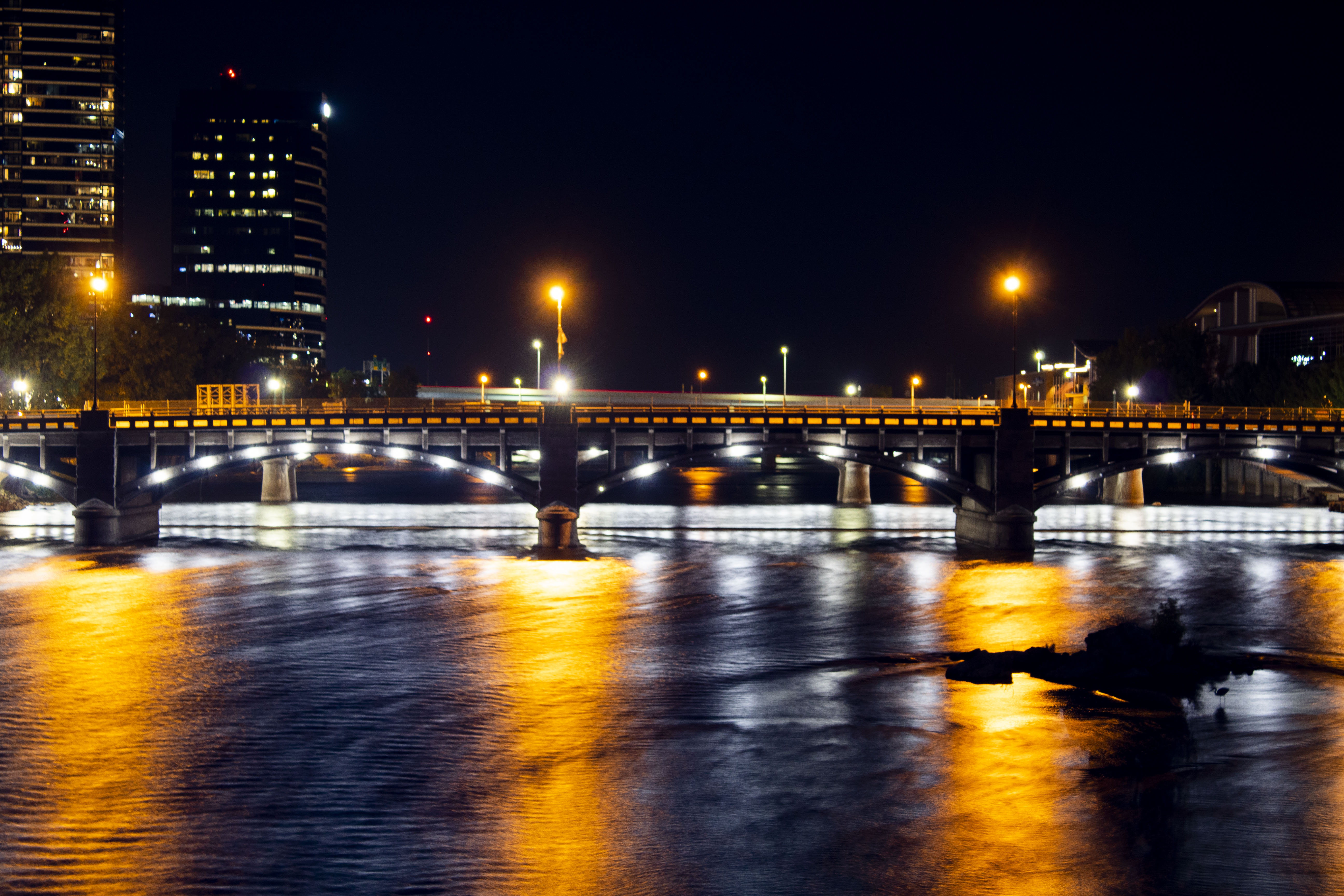
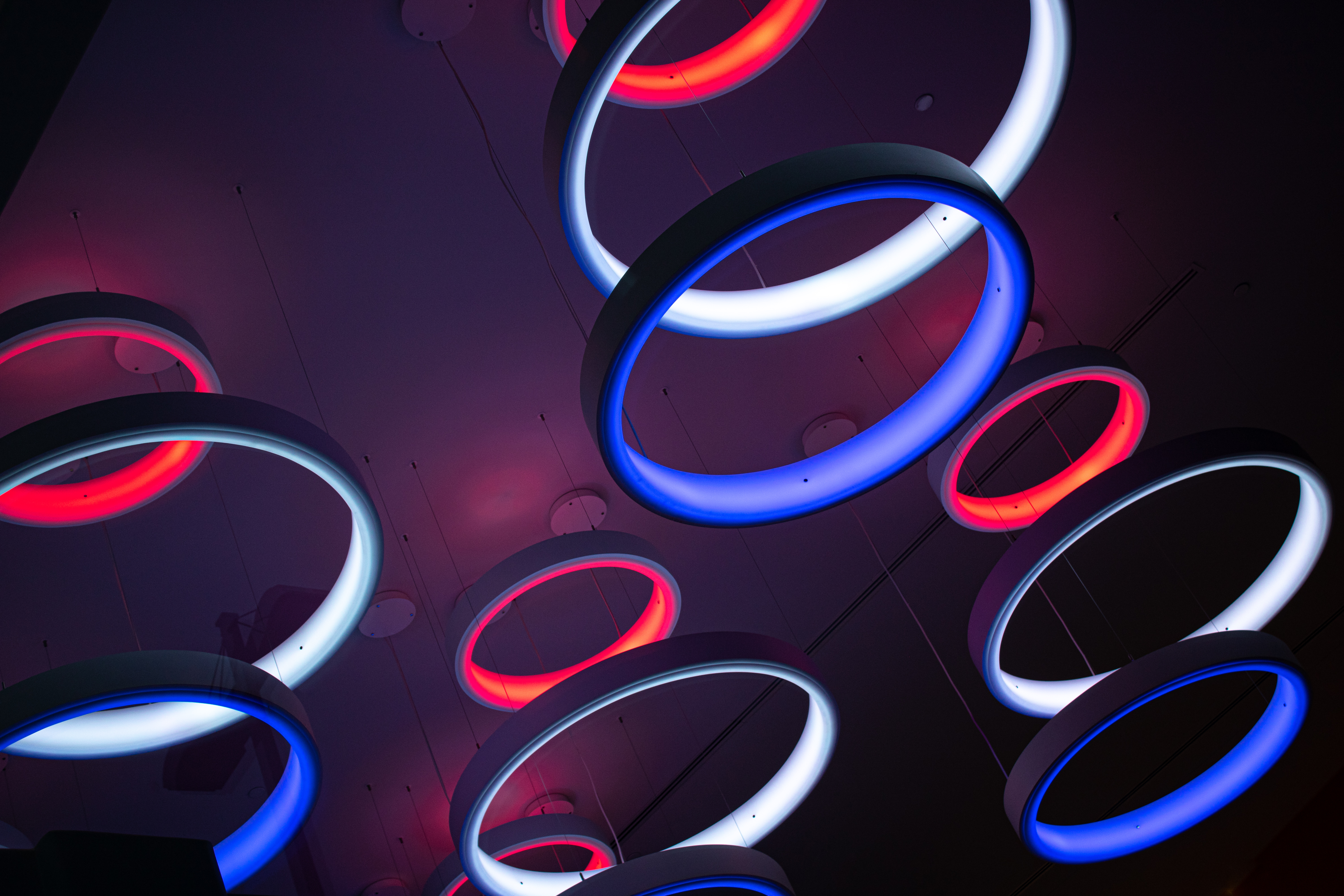
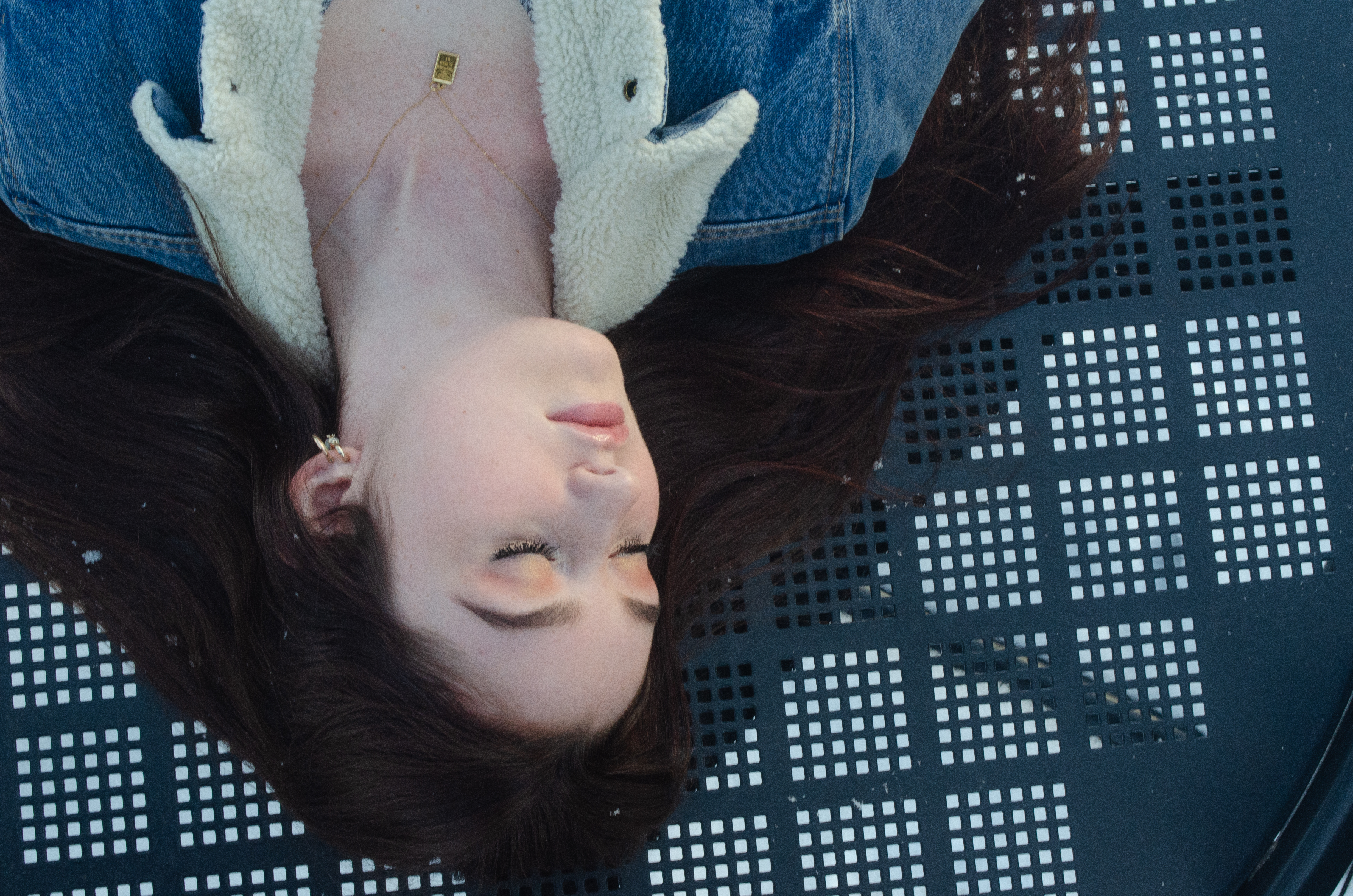
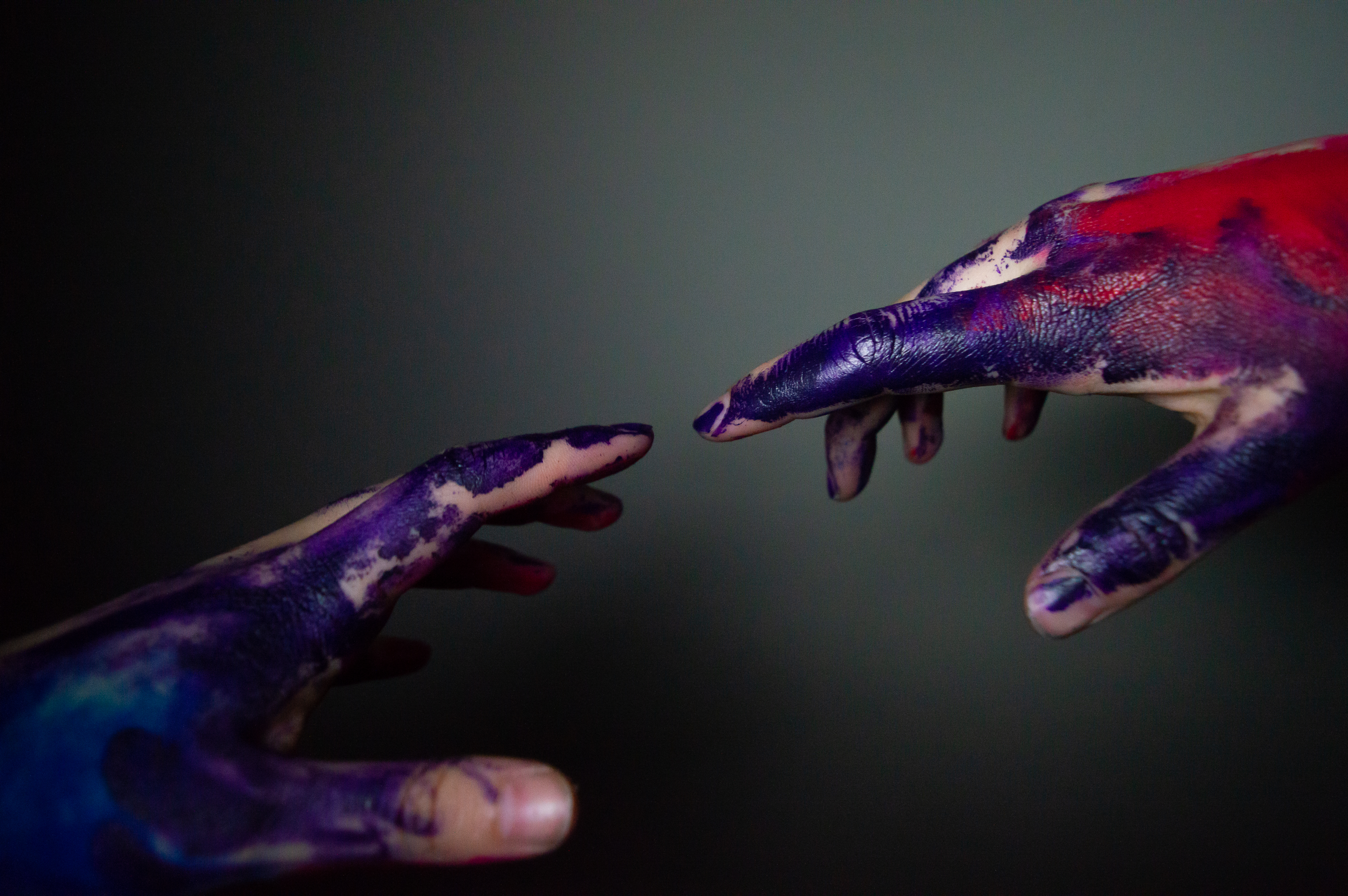
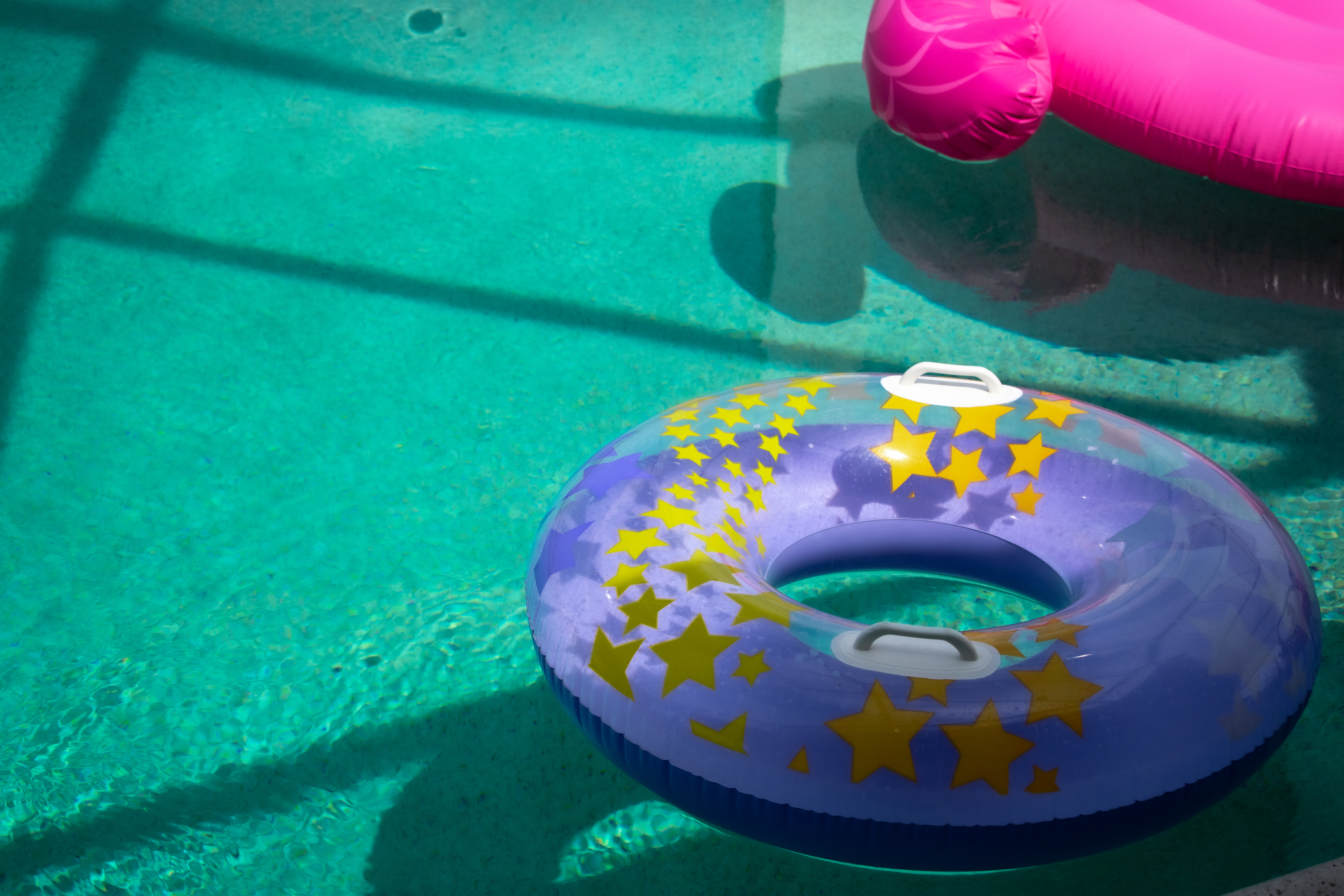
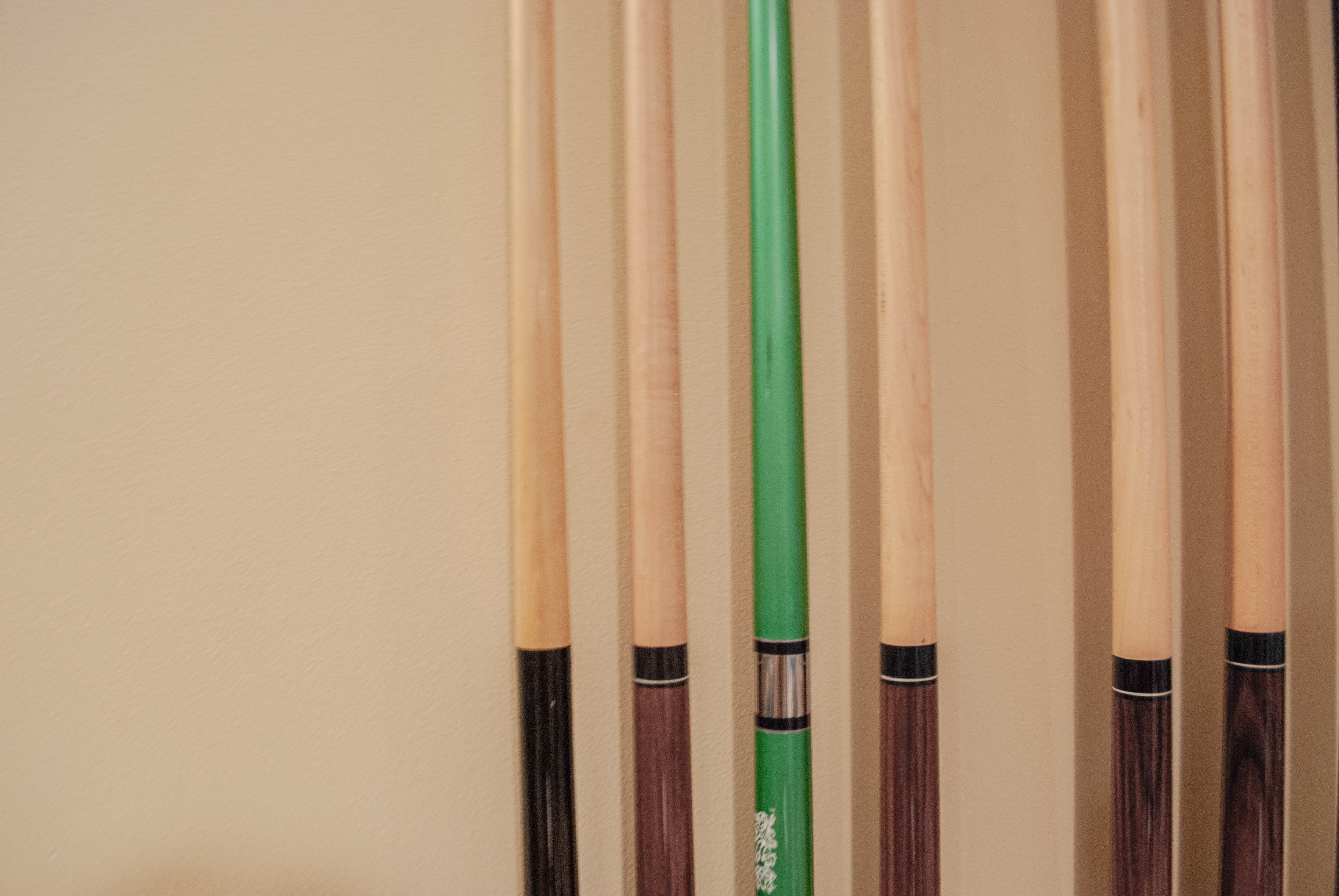
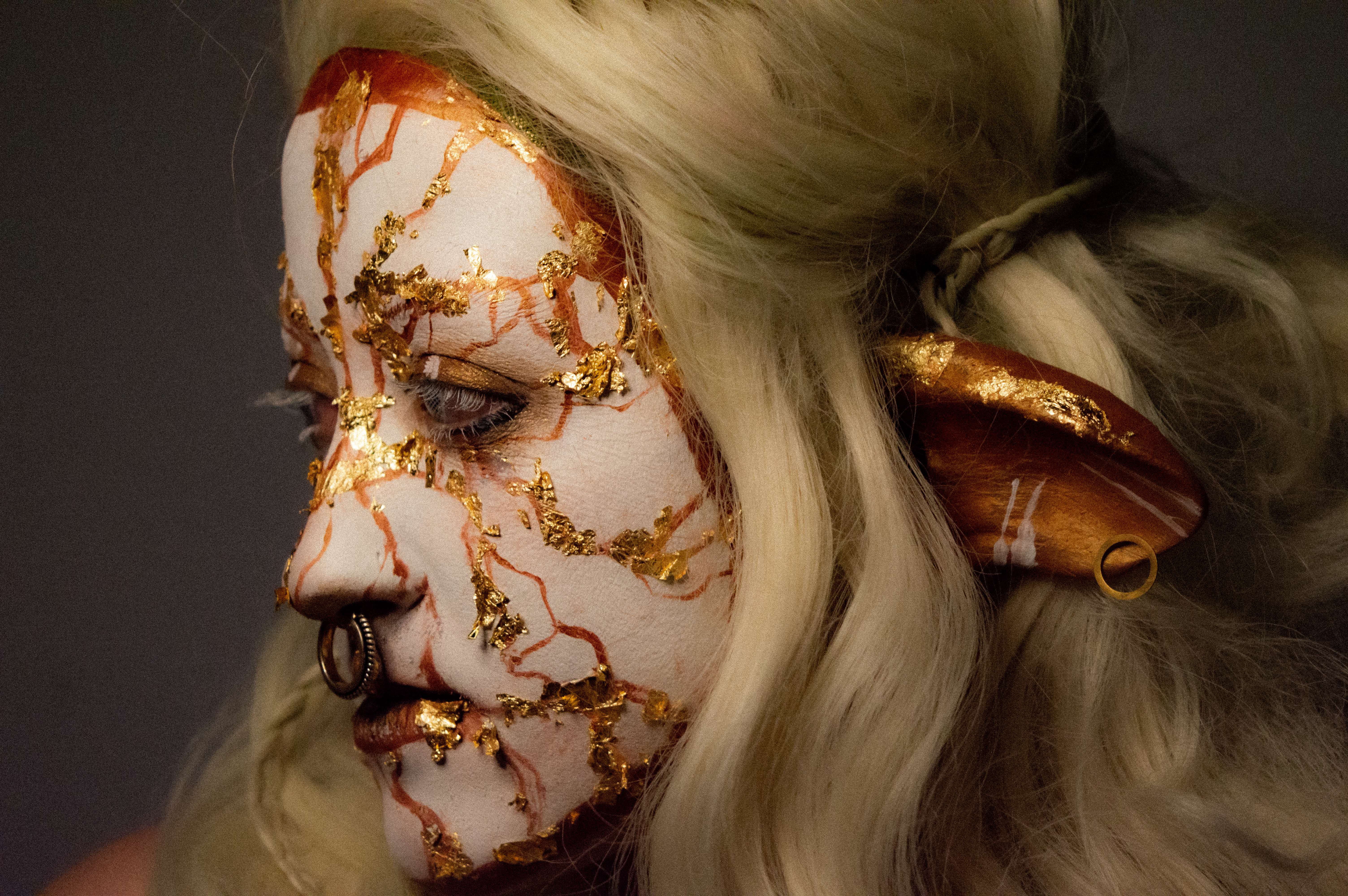
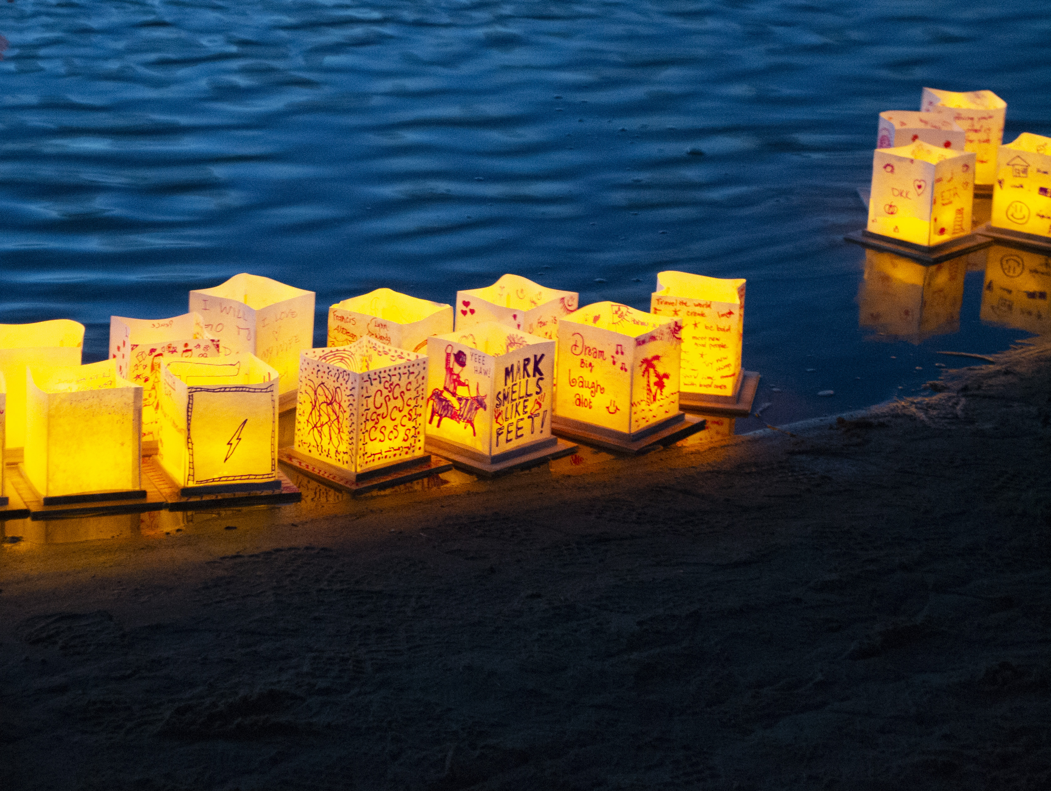
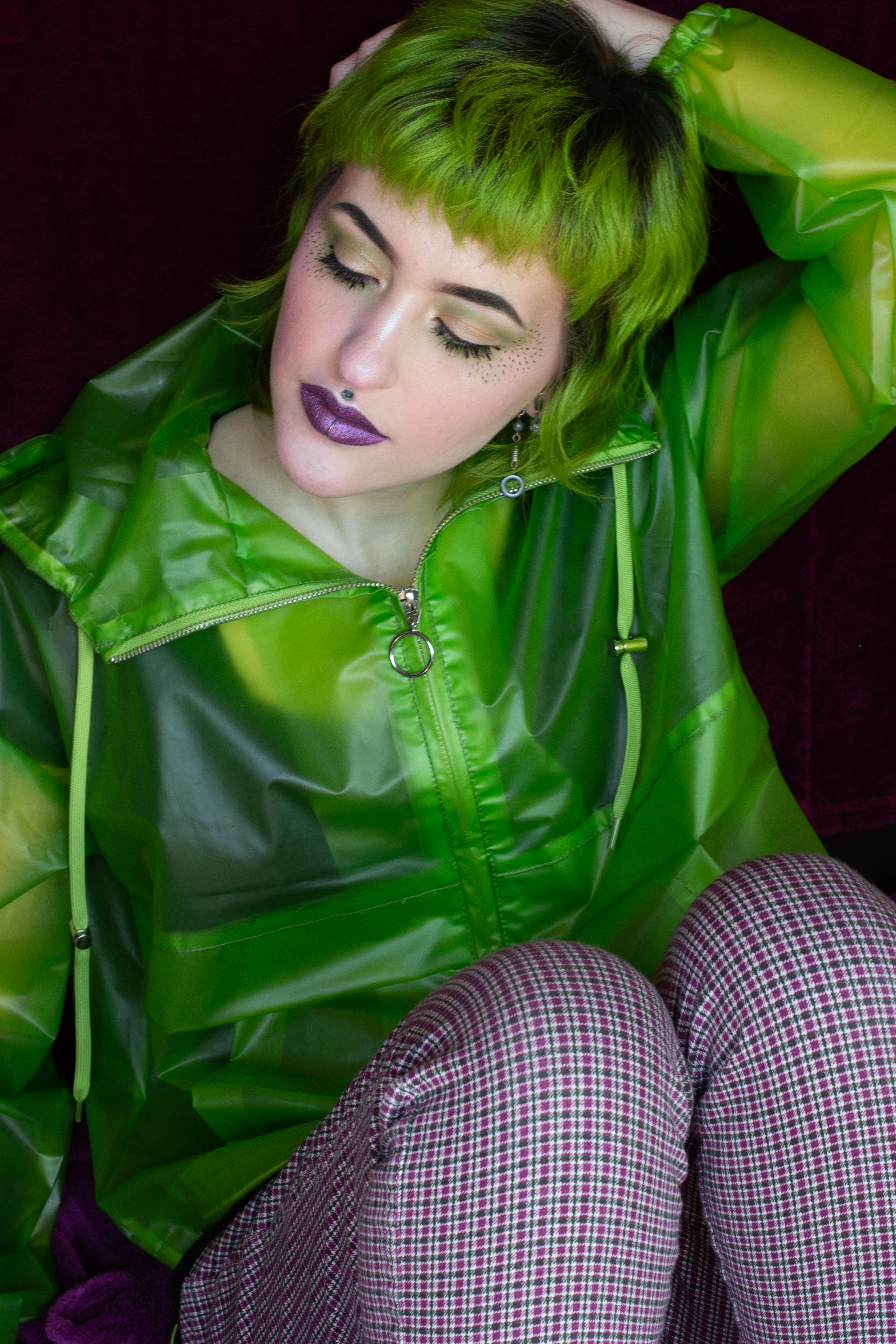
Finally the last step of color discussion – is the idea of mixed color combinations. These images can engage with the topic of fashion, or it can be architecture, objects, or places within the real world.